All You Need to Know About Email Marketing: Tips, Tricks and Resources
Only a couple of years ago, there was talk about email marketing's heyday already being over. The rise of social media and mobile devices, the thinking went, would spell the end for email marketing since communicating via emails would become rare. But, as the saying goes, the report of the death of email marketing was an exaggeration – today, it is still one of the most important and most popular communication tools out there. Even in the age of „WhatsApp“ email stays one of the most used instruments.
 Cutting-edge Marketing Emails do not mean bland and boring copy as it did some years ago. Nowadays, professional emails rather look like websites; they are thoroughly designed and meant to contain useful content, making them more attractive to actually read. However, there are some noteworthy aspects to making your email unique.
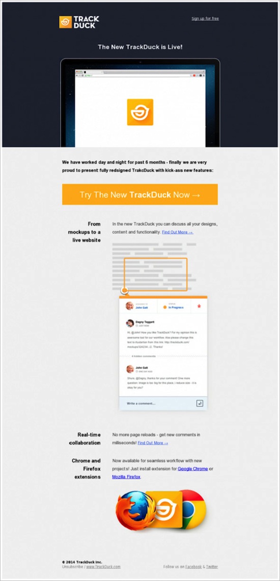 As a rule, notification emails are quite short in length. The goal is to entice the client to do something specific (Call-to-Action).
 Email newsletters often emulate the design of the company website that sometimes is challenging to achieve for designers. You need a perfect instinct for hierarchy, the main content, and additional information.
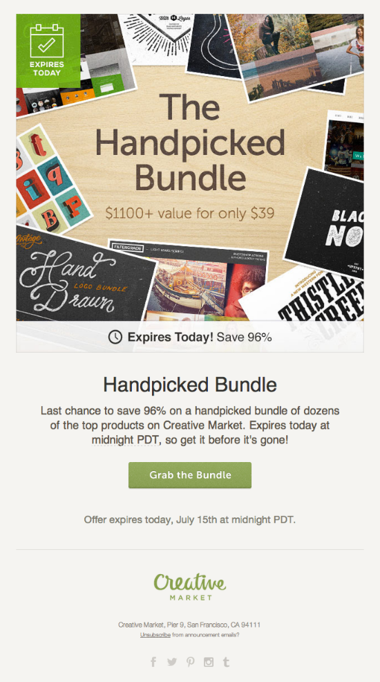 Usually, these emails are short and get straight to the point.
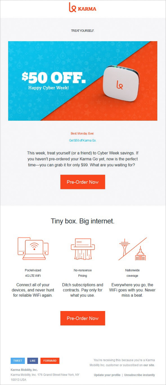 Some tips about how to hassle-free create nice, appealing email:
 It totally makes sense to add Social share buttons. They should be placed prominently without diverting the attention away from the Call-to-Action area, or you risk missing the intended purpose of your email.
Easter Socks Eggstravaganza!
 A lot of users' email clients are set to block the display of images. Therefore, the email needs to be designed in a way that enables the reader to get the message instantly even without pictures. So make sure to use a compelling and nice typography - not the least for the relevant headers - to guide the readers through your message. With a compelling typography and a straight to the heart copy the audience might choose to reload the images and have a closer look at the email after all, or even gets already hooked at the Call-to-Action area – and acts.
 Do not forget to thoroughly test your email in order to get rid of all bugs and errors. Do it with as many devices as you can lay your hands on to make sure the email looks good on mobile devices. Furthermore, extensive testing helps you find the best frameworks and templates for your emails.
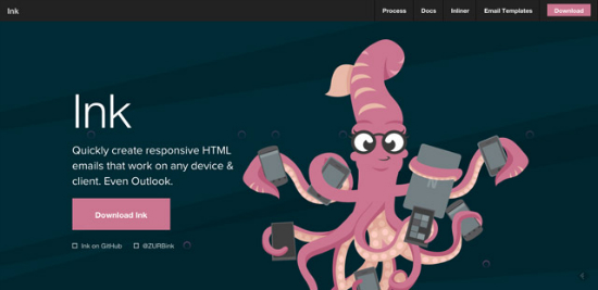 The Ink framework by Zurb, the creators of Foundation, enables you to create responsive email that work on any device and email client. There are some templates, for example, one containing a hero image, and a template with a sidebar. Ink is easy to install and to work with.
Cerberus
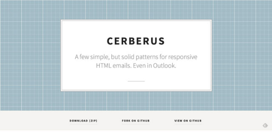 Cerberus is another very popular framework, offering templates waiting to be filled with your content. Afterwards, you get emails that work with every email client or system, including Outlook, Android, or the mobile Gmail.
Template Builder
 The free Template Builder comes with an excellent WYSIWYG (What you see is what you get) editor that enables you to come up with nice email designs right from the start. Just add images and articles from your hard disk to the template, modify the recipients and add links and social share buttons. You could also register at CampaignMonitor and use their email services (9 USD per month) or you can download your finished email and send it out using your own email client. Maybe you want to browse the prefab templates and use them after applying some changes.
Antwort
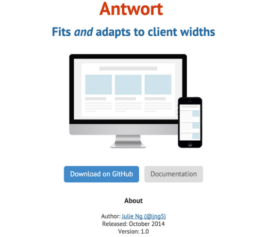 „Antwort“ is another framework for creating HTML emails. It works with all clients like Outlook or Google Mail and offers fully responsive templates, providing a perfect look regardless of the screen resolution.
Graphic Mail Newsletter Templates
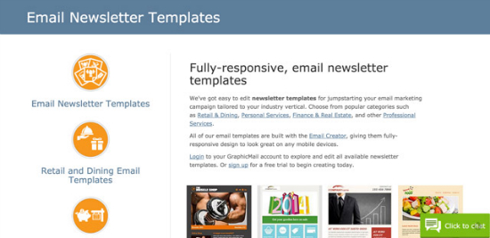 Graphic Mail provides you with all sorts of email templates which you can modify according to your needs. You can sign up for a free test account or choose one of the subscription models which start at 9,95 USD per month.
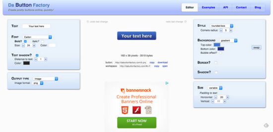 This easy-to-use tool helps you create CSS buttons. Because some email clients block the display of images by default there might be problems displaying Call-to-Action areas as well. By using this tool you get rid of this issue because CSS buttons will definitely be displayed
Bulletproof Email Buttons
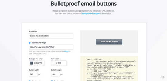 Bulletproof is another service that allows you to create VML or CSS buttons with the help of a visual or CSS editor. Choose between three buttons, modify the background color and copy, and add a link. Ready to go!
Email on Acid
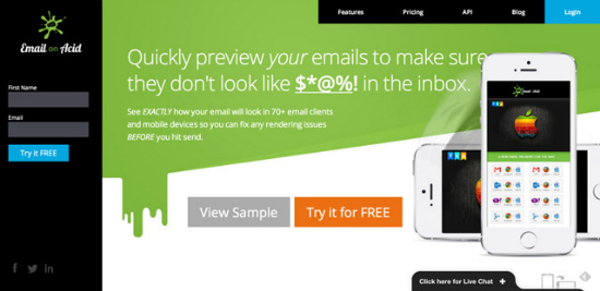 This is a great testing tool that allows to check your email design on a variety of devices. It also shows you broken links and further errors. There is a free 7-day-trial, letting you check if this service is something you might find useful. If you decide to buy a license afterwards, prices start at 45 USD per month.
Litmus
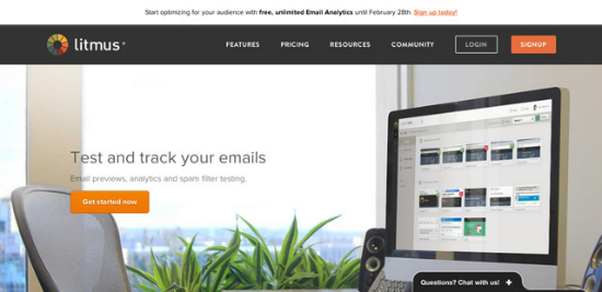 With Litmus you can also put your email to the proverbial acid test. It comes with the same features as „Email on Acid“, but additionally checks whether your email will get relegated to your recipients' spam folders or not. Litmus offers a 7-day-test trial, too. Afterwards, you can purchase a license starting at 79 USD per month.
HTML to Text Email Converter
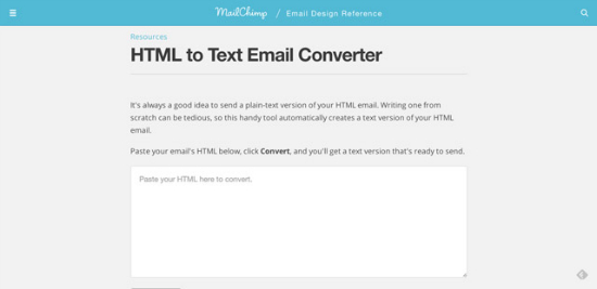 This free tool by MailChimp generates a plain HTML version of your email. Just copy the HTML into the box and click „Convert“.
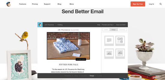 MailChimp is for sure the best-known and most popular email service. For good reason: MailChimp offers a free account, allowing you to ship up to 12,000 emails per month to up to 2,000 subscribers. On top, you get great features for designing your emails. After dispatching the email, you can analyze them and measure the success of your email campaign. The service is available in English only. Paid-for accounts start at 10 USD per month.
MailKitchen
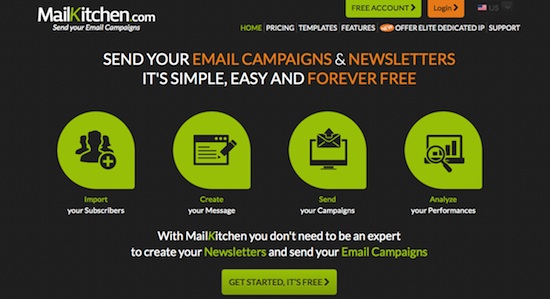 MailKitchen is available in several languages. The free account allows you to send up to 15,000 emails to up to 5,000 subscribers. You can apply your templates or use the ones provided by MailKitchen. There is an Analytics feature as well. As of writing, the paid-for accounts start at 1 € per month.
ReachMail
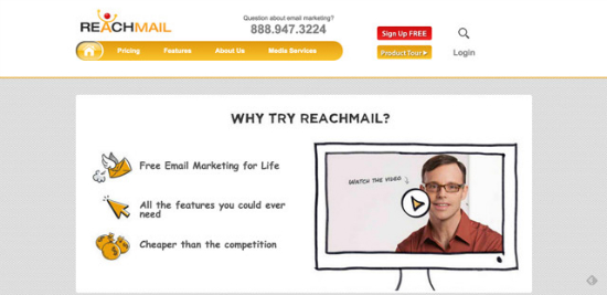 ReachMail is quite similar to MailKitchen. It also allows you to send up to 15,000 emails to up to 5,000 contacts. Premium accounts start at 10 USD per month.
Amazon SES
 Amazon SES is a valid option for small companies that are already Amazon EC2 customers. This email service is entirely free for Amazon EC2 clients and lets you send up to 62,000 emails per month. Need to send more? It is 10 US Cent per every additional 1,000 contacts. For all non-Amazon EC2 customers: on this page you can check the respective prices.
 Cutting-edge Marketing Emails do not mean bland and boring copy as it did some years ago. Nowadays, professional emails rather look like websites; they are thoroughly designed and meant to contain useful content, making them more attractive to actually read. However, there are some noteworthy aspects to making your email unique.
Primary Email Types
There are different types of emails serving different purposes. Choosing the right one for the audience you want to target and the content you wish to share, is hugely important for a perfect marketing campaign. Pick the email type most fitting to your goals and design it to make your message really stand out. Email types include:Notifications
This is the most common form of email you will see in your inbox. Like, if you are on Facebook or Twitter you would normally get those more or less frequently. Got some new follower, someone has tagged you in a photo? Bing, there comes your email. On the other hand, small businesses can use notifications as announcements. Most of the time, if you sign up for a newsletter or create an account at a website you will get a confirmation. But this email can easily be used to further engage the client, like sending him to the company blog, asking her to confirm her email address or adding details to his profile. TrackDuck Launch As a rule, notification emails are quite short in length. The goal is to entice the client to do something specific (Call-to-Action).
Newsletter
Another regular guest in your inbox is the newsletter. This email type usually contains informational content such as new products, new product presentations, links leading to website content (landing pages), and CTAs (Call-to-Action). Warby Parker Email newsletters often emulate the design of the company website that sometimes is challenging to achieve for designers. You need a perfect instinct for hierarchy, the main content, and additional information.
Transaction Emails
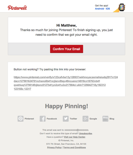
They are quite similar to notifications but contain another Call-to-Action area for confirming orders or the like. Most of the time, you will get one of those after you started to purchase something online but did not close the transaction correctly. Signing up for a test account and being asked to upgrade to a pro account would be another example for a transaction email. As would be a mere confirmation email sent from an automated system. Pinterest
Marketing Emails
A business proposal to a client (or a prospective one) containing a bold Call-to-Action regarding a purchase would be a good example. Special offers, discounts or seasonal offers could be part of such an email. Usually, these emails are short and get straight to the point.
Email Marketing: Key Features and Tips
Like all web content today, HTML email should be responsive. After all, an ever growing number of people access their email with mobile devices, like smartphones and tablets, instead of desktop computers. Therefore, you should adapt the email in regard to display resolution and typography. Karma Some tips about how to hassle-free create nice, appealing email:
- A width of 600 pixels is sufficient to display content on both desktop and mobile, without any problems.
- Images should also be responsive. Otherwise the design could be ruined.
- Use a sufficient font size, check readability on smaller screens. Typography needs to be responsive, too, it has to adapt to different screen sizes.
- Call-to-Action buttons and links should be adequately measured, making it possible to click them without any problem even on small screens
- Use display: none; to hide details that are dispensable when reading on a mobile device and would overload the email. Good legibility and reducing to what is essential are crucial for the mobile view. Don't let your email look clumsy on mobile screens.
Ideas about Email Content
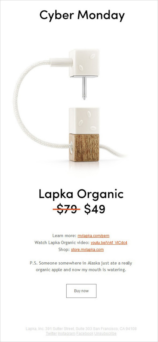
Contrary to websites that are accessed actively, emails often arrive pretty surprisingly – apart from having a newsletter subscription or the like. Therefore, the main challenge is to have people open your email at all, instead of moving it to the spam or trash folders right away. You need to grab the audiences' attention before they switch to the next inbox message. The best way to do this is by making your email look personal and useful. Already the subject line should convey the feeling this email was written especially with this one client in mind. The copy itself should be concise, clear, and conclusive, getting straight to the point. Remember you do not have enough space for fancy graphics and content to entice the audience with your product, services or offer. You need short, easily understandable content and a clear Call-to-Action, which leads prospective customers to your website where they can purchase something or do another thing. The email content is only there for capturing attention. A distinctly placed Call-to-Action button takes the readers right to your landing page – the page with your offering. Lapka It totally makes sense to add Social share buttons. They should be placed prominently without diverting the attention away from the Call-to-Action area, or you risk missing the intended purpose of your email.
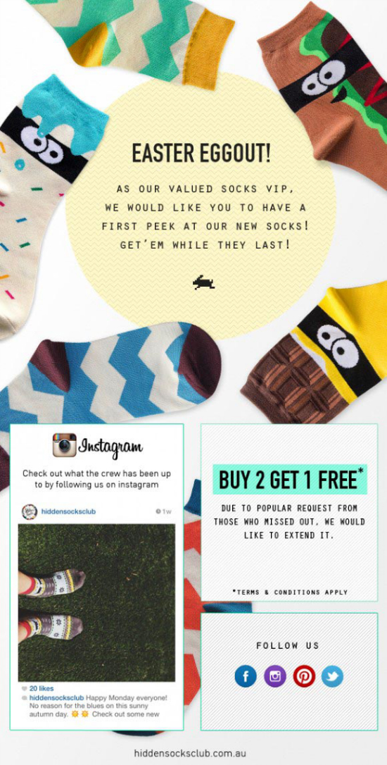
Easter Socks Eggstravaganza!
 A lot of users' email clients are set to block the display of images. Therefore, the email needs to be designed in a way that enables the reader to get the message instantly even without pictures. So make sure to use a compelling and nice typography - not the least for the relevant headers - to guide the readers through your message. With a compelling typography and a straight to the heart copy the audience might choose to reload the images and have a closer look at the email after all, or even gets already hooked at the Call-to-Action area – and acts.
Call-to-Action Email Best Practices
In case you missed it: A call to action is the most important element of an email. No matter what type of email you send, almost always will there be some call to action. Therefore, all Call-to-Action areas should stand out, should be designed concisely and of contrasting color. There are two main types of a Call-to-Action: simple links or buttons. Read some detailed instructions about Call-to-Action areas here and find out how to utilize the different concepts. Some more specific recommendations about the design of Call-to-Action areas:- Do not try to squeeze in your links somewhere. Rather make your headlines clickable. This way, you can have it both ways: you get more eye-catching headers, plus you are able to guide the readers to the main point of your message.
- Buttons are for clicking. But these have to work on smaller screens, too. So make them large enough and put some distance between them and other content elements.
- The Call-to-Action area should not sit at the bottom of your email but be placed prominently. This area should command all your audience's attention. It will not do the job if they have to scroll down. Be sure to catch the readers' interest as early as possible.

Further Tips and Advice
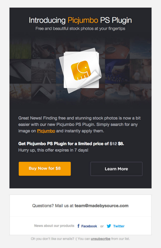
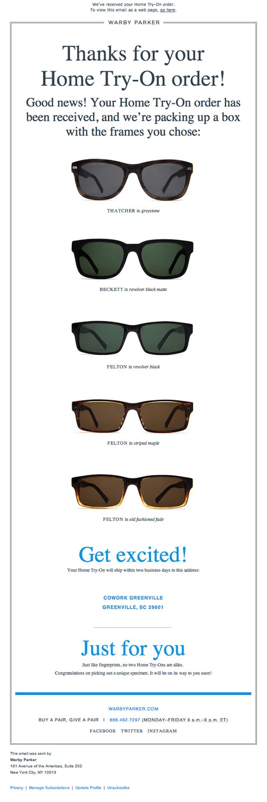
Design your email as minimalist as possible. It is better for mobile anyway and increases the chances of your email being opened. Warby Parker - Thanks for Your Order Do not forget to thoroughly test your email in order to get rid of all bugs and errors. Do it with as many devices as you can lay your hands on to make sure the email looks good on mobile devices. Furthermore, extensive testing helps you find the best frameworks and templates for your emails.
Email Design Frameworks
There are quite a few free - or low budget - email editors for designing professional and appealing email available. Just choose the one that fits your needs and requirements. Of course, you are free to develop your HTML template from scratch, but frameworks and boilerplates help you save a lot of time while simultaneously delivering excellent results. Ink The Ink framework by Zurb, the creators of Foundation, enables you to create responsive email that work on any device and email client. There are some templates, for example, one containing a hero image, and a template with a sidebar. Ink is easy to install and to work with.
Cerberus
 Cerberus is another very popular framework, offering templates waiting to be filled with your content. Afterwards, you get emails that work with every email client or system, including Outlook, Android, or the mobile Gmail.
Template Builder
 The free Template Builder comes with an excellent WYSIWYG (What you see is what you get) editor that enables you to come up with nice email designs right from the start. Just add images and articles from your hard disk to the template, modify the recipients and add links and social share buttons. You could also register at CampaignMonitor and use their email services (9 USD per month) or you can download your finished email and send it out using your own email client. Maybe you want to browse the prefab templates and use them after applying some changes.
Antwort
 „Antwort“ is another framework for creating HTML emails. It works with all clients like Outlook or Google Mail and offers fully responsive templates, providing a perfect look regardless of the screen resolution.
Graphic Mail Newsletter Templates
 Graphic Mail provides you with all sorts of email templates which you can modify according to your needs. You can sign up for a free test account or choose one of the subscription models which start at 9,95 USD per month.
Free Email Tools and Plugins
These email tools help you design buttons and Call-to-Action areas. Additionally, they can be used for testing and debugging purposes. Da Button Factory This easy-to-use tool helps you create CSS buttons. Because some email clients block the display of images by default there might be problems displaying Call-to-Action areas as well. By using this tool you get rid of this issue because CSS buttons will definitely be displayed
Bulletproof Email Buttons
 Bulletproof is another service that allows you to create VML or CSS buttons with the help of a visual or CSS editor. Choose between three buttons, modify the background color and copy, and add a link. Ready to go!
Email on Acid
 This is a great testing tool that allows to check your email design on a variety of devices. It also shows you broken links and further errors. There is a free 7-day-trial, letting you check if this service is something you might find useful. If you decide to buy a license afterwards, prices start at 45 USD per month.
Litmus
 With Litmus you can also put your email to the proverbial acid test. It comes with the same features as „Email on Acid“, but additionally checks whether your email will get relegated to your recipients' spam folders or not. Litmus offers a 7-day-test trial, too. Afterwards, you can purchase a license starting at 79 USD per month.
HTML to Text Email Converter
 This free tool by MailChimp generates a plain HTML version of your email. Just copy the HTML into the box and click „Convert“.
The Best Free Email Services
The following tools and services help you design email, manage mailing lists or deliver the email to your customers. MailChimp MailChimp is for sure the best-known and most popular email service. For good reason: MailChimp offers a free account, allowing you to ship up to 12,000 emails per month to up to 2,000 subscribers. On top, you get great features for designing your emails. After dispatching the email, you can analyze them and measure the success of your email campaign. The service is available in English only. Paid-for accounts start at 10 USD per month.
MailKitchen
 MailKitchen is available in several languages. The free account allows you to send up to 15,000 emails to up to 5,000 subscribers. You can apply your templates or use the ones provided by MailKitchen. There is an Analytics feature as well. As of writing, the paid-for accounts start at 1 € per month.
ReachMail
 ReachMail is quite similar to MailKitchen. It also allows you to send up to 15,000 emails to up to 5,000 contacts. Premium accounts start at 10 USD per month.
Amazon SES
 Amazon SES is a valid option for small companies that are already Amazon EC2 customers. This email service is entirely free for Amazon EC2 clients and lets you send up to 62,000 emails per month. Need to send more? It is 10 US Cent per every additional 1,000 contacts. For all non-Amazon EC2 customers: on this page you can check the respective prices.
More reviews of more cheap email services
Of course these aren’t all the choices you have, there are over 400 email marketing tools on the market. And picking affordable is a sure way to boost your email marketing ROI. There are enough email marketing tools that have a free tier and are very cheap. Have a look here to find 8 more cheap email marketing services with an in-depth review and pricing. An additional tip, for instance for non-profit or startups is to check if the ESP has a discount for you (they might very well have).Conclusion
Email is alive and kicking. Even more so, it is an indispensable, highly effective marketing tool that can provide you with a lot of new customers if applied correctly. Clever email marketing comes with high conversion rates, turning prospective clients into paying customers. A lot of businesses make their living with email marketing. Now it is your turn!Related links
- Ink email framework
- Cerberus email framework
- Template Builder email framework
- Antwort responsive email framework
- Graphic Mail Free Newsletter Templates
- Da Button Factory - Creating CSS buttons
- Bulletproof E-Mail-Buttons - Creating CSS buttons
- Email on Acid - Email testing tool
- Litmus - Email testing tool
- HTML to Text Email Converter
- MailChimp
- MailKitchen
- ReachMail
- Amazon SES
- Amazon EC2

hi, i have recently start my product to sell online and i am doing Email marketing for it, as before i was doing many mistakes, but after reading your article i have learn much ideas and will make new strategy for Email Marketing, Thanks again for sharing your idea with us.
– Shreya
Yes, It is really an enough explanation about email marketing.
Thank you so mush for sharing this article .
Email marketing is an important way to connect with the customers or clients. Proper email marketing leads to success. Thanks for ths excellent post. Gives proper idea how to use email marketing
Email marketing is an important way to connect with the customers or clients.