10 Best Practices for Creating Exceptional Website Pop up Design to Increase Conversions

How do you catch visitor attention when even the most creative ads are, by definition, an interruption and the majority are viewed almost universally as a nuisance?
It’s a formidable challenge that marketers face in a world of shrinking attention spans.
What if we told you that you could do it with good old-fashioned pop ups provided you follow a few guiding principles that underlie some best practices?
If the name alone can cause conniptions, we know their reputation for irritation goes before them.
Yet despite this, most folks aren't terminally averse to pop ups per se. Look no further than how long they’ve stuck around and their current use.
Play by the rules of permission marketing and combine that with exceptional design, and you can reach customers with your message.
And here’s the thing: we don’t see them going away anytime soon.
Pop ups can help you expand your subscriber list and give your conversion rate a jolt.
One of the fastest routes to increasing conversions is having an understanding of your customer’s buying habits. That means having a firm grasp of important metrics, such as knowing AOV meaning and conversion rate. Track them together to calculate your gross revenue. To optimize their average order value, businesses can add cart reminder pop ups to encourage visitors to purchase product bundles or avail of volume discounts.
People, it seems, are happy to engage with good designs and offers that add value.
With that in mind, we’ve created this guide.
Read on as we explore 10 best practices for putting together exceptional website pop up design that converts.
1. Consider different types
The most familiar default pop up design is the square window that appears in the middle of the screen. In an e-commerce context, these are probably the most aggressive kind and interrupt browsing. This front-and-center approach can be used to signify something important.
For example, consider a healthcare contact center setting where there’s a need to maintain critical service levels. Alerts automatically pop up for supervisors when levels dip below a specific threshold.

In business, this type of pop up is best when you’re confident your message is click-worthy or used as a bold exit-intent trigger. Examples include offers for immediate purchases or journalism paywalls.
The slide-in pop up is popular because it allows visitors to choose whether they want to engage. Subtle and unobtrusive, this type can go a long way toward getting users to opt in for teaser content such as an email newsletter that actually gets read.
Animation is another worthy design consideration. Higher-effort approaches can feel less like an ad and more like a creative, aesthetically-pleasing feature of the website pop up design that elevates the user experience.
2. Match pop up design with site branding
Why align the design of your pop up with the branding of your site? The reason goes back to the genesis of the pop up and its fallen status ever since as a pesky intrusion.
Website pop up design tactics used to be so breathless, salesy, and heavy-handed in their use of colors that the original creator felt the need to apologize.
Add in the fact that scammers use pop ups to deceive users into downloading malware. In this context, today’s brands use designs that complement the rest of their content to grab attention in a way that earns trust.
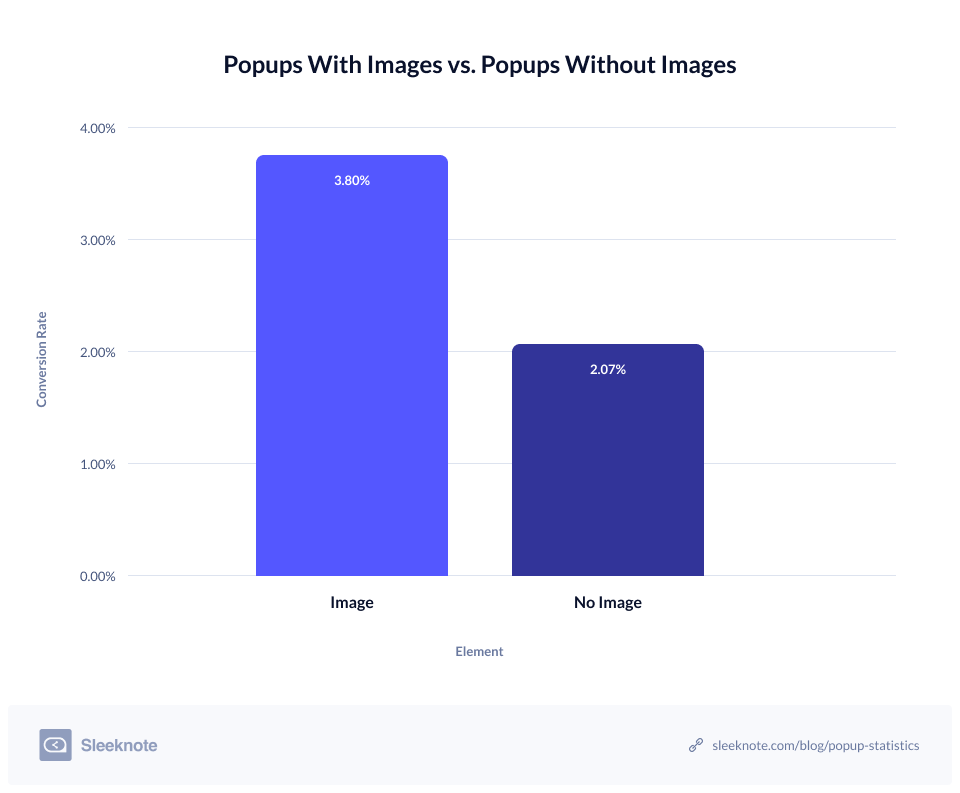
It's a more subdued approach. But using visual hierarchy and enticing images can produce a cleaner design and ensure your pop up appears like a genuinely good offer, which off-brand, gimmicky tactics can undermine.
It’s also a safe bet for increasing conversion rates, generating leads, and decreasing your cost per purchase.

3. Communicate effectively with color and shape
There’s nothing too surprising about this one. Visual elements, such as color and shape, are essential to a good design that avoids bounce rates. For example, pastel colors can emanate calmness, while white can evoke a sense of mental clarity.
Loud and proud colors will make your message stand out, and a stark contrast of light versus dark can be a stylish plan.
Likewise, your choice of shape also speaks to visitors. Rounded shapes communicate much-needed approachability in contrast to the sharp edges of traditional square windows.
4. Nail CTAs
Visitor attention spans aren’t getting any longer. And when it comes to pop ups, the instinct to close them immediately is near Pavlovian. Given such a short window of opportunity, keep their content clear and to the point.
Here's where your call-to-action (CTA) comes in. Make a point to use hard-hitting copy to get users to act quickly. Craft powerful headlines that crystalize the benefits of your offer if they take the action you want. Use contrasting colors to make great CTA buttons that can’t miss.
5. Use fewer fields to increase conversion rates
You’ve heard of unified field theory, right? No, we’re not talking particle physics. We mean the simple fact that asking users to fill out fewer input fields makes signing up that much quicker. But because the more information you can get about your prospects is usually the better, this is easy to overlook.
Note that you can get in touch and follow up with those who sign up with their email address later. If it’s an important prospect, you can always improve your business communications with an HD call once you’ve started the ball rolling.
As well as saving precious seconds that can entice new subscribers, many folks are uneasy about parting with too much personal information. The data is in - fewer fields mean less effort for customers and more conversions.

6. Design separately for mobile
Mobile is taking over e-commerce, and companies are now reaping the benefits of providing better customer service by having their own business app. While Google can penalize site owners whose lackluster website pop up design hampers the mobile experience, you needn't refrain from using them entirely.
But you do have to know how to design them for different devices. Mobile pop ups can still be a confusing nightmare to navigate.
Following best practices for mobile pop ups means scaling down your desktop designs and reducing the number of elements that can fit into less screen space. Mobile designs need to be optimized for a portrait orientation. Plus, there’s the fact that fields are harder to fill in using one hand and a thumb. Minimalist design with defined buttons will keep them tap-friendly.
Conversely, mobile design uses unique kinds of input that intelligent website pop up design can exploit. The solution? Follow the suit of designers who use a mobile-first approach and start by designing a separate mobile version.
7. Personalized offers and conversational copy establishes credibility
We’ve come a long way from the days of ubiquitous, in-your-face pop ups. Consumers are pretty much over those thoughtless designs.
How can you regain the trust of jaded site visitors? Regain trust by being sophisticated in how you frame messages. Remember, you’re adding value and providing helpful tips. Offers that ask users for their input and preferences also work well.
Pop ups with personalized offers have better vibes than those that feel like traditional ads and nudge consumers to share personal information. That’s because they encourage interaction with your brand and cultivate the connection essential to trust. For similar reasons, ditch stuffy business-speak. Instead, be sure to communicate with your potential customers in a friendly and conversational tone.
8. Pay attention to fonts and spacing

Another important element is fonts. As a rule, sticking with your standard website font for your pop up copy will increase readability. And you can combine different fun fonts for headlines - up to a maximum of three. Experimenting with different fonts can accentuate your message.
One thing you can’t experiment with, though, is spacing. Consistency is key to professional-looking pop ups. As your invisible content, it’s an easy thing to neglect. When your pop ups are askew, it’ll soon show up in your conversion rate.
9. Iterative design
While these are tried-and-true best practices, every business is unique. You probably have your own ideas about what looks good to you. And, of course, theories, tips, and tricks can point you in the right direction. But what really matters is performance. Does your design drive conversions? The only way to find out is to test and evaluate it.
Once you have your findings - from A/B tests, for example - you can make changes and continue to refine your design until its performance meets your goals. Tracking design metrics is just as important as all other essential metrics businesses monitor to stay afloat (depending on company size, these usually fall under the remit of revenue operations and sales operations).
At the end of the day, consumer opinion gauges whether or not your design works.
If all this talk of instant testing and changing speaks to a need for remote agile team collaboration, don’t worry, we’ve got best practices for that too!
10. Don’t sleep on the close button
Okay. We’ve already covered the importance of compelling CTAs for optimizing conversions. How showcasing tangible benefits makes offers feel more valuable. Alas, while your design aims to get users to convert, most will look to close your pop up. The kind of good user experience that pays dividends in the long run hinges on their ability to perform this action.

The most common option is having an X in the top right corner. However, some websites favor a slightly less prominent sweet spot or use negative language to highlight value missed.
Crucially, this ignores the visitors who don’t click through yet still become customers. And that exasperation at your sarcastic pop up can so easily spill over and hurt your brand.
Wrapping up
If you’re a skeptic and think pop ups are impossibly old school, we get it.
And yet, it’s not for nothing that millions of eCommerce sites still depend on them.
Modern, sophisticated website pop up design can thread the needle of catching visitor attention and getting a hearing for your offer.
We hope these best practices can cause you to rethink their potential. Ready to opt in NOW?
Featured image by Kelly Sikkema on Unsplash
