Web Design For Beginners: A Step-By-Step Tutorial

Your website serves as the first thing potential customers see when they get in touch with your brand. A well-designed website highlights your services and unique selling propositions (USP), resulting in higher conversion rates, and more sales for your business.
A lot of people confuse web design with web development. While web development deals with the backend development of the site, web design has more to do with how your website appears—layout, colors, copy, and site functionality. If you’re just starting as a web designer, this tutorial will show you how to design websites.
Get the brand guidelines
Designing a website is often part of a brand-building process. Most brands start with a logo, a tagline, fonts, and colors. These elements vary according to the brand’s personality and the image it wants to convey to the public.
If your brand was a person, what would they be like? Would he be that uncle who is the life of the party or your refined cousin who sips martinis? Translating this to your website, what color, layout, and fonts should your brand contain?
For example, your brand’s primary color is navy blue. Determine what other colors you’d like to pair with that blue. For most brands, two tones are enough. Assess the color wheel, and choose a partnering complementary or analogous color. For example, blue goes with yellow, orange, or purple, depending on the effect you’re looking for. When you’ve decided on your brand colors, get the hex code for those colors, and stick to them.
The example from Tostitos below shows how its website uses well-defined visual elements to define the brand’s personality. The main colors revolve around blue and red, and the website uses the same fonts for the menu and the copy.

Finally, your brand tone is the voice of your personality. What kinds of phrases does your personality use? Apply that to your copy. Should your writing be formal, casual, exciting, academic? These are things to consider with brand tone.
Define your sitemap
Once you’ve defined your branding, you need to create a sitemap, which is comparable to a building’s blueprint. A sitemap provides a general overview of your website. It outlines the content that will appear on every page of your website. For instance, if your website sells gluten-free products, its sitemap might look like this:
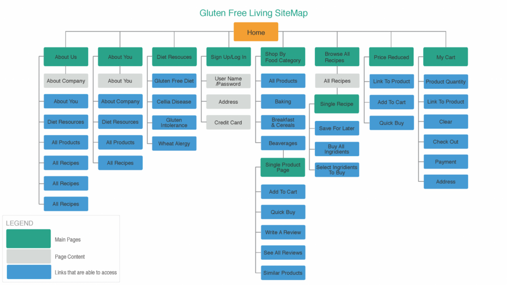
This type of sitemap is also known as an HTML sitemap. It displays the structure and hierarchy of the different pages on your website and how a user can navigate through them. For example, a user interacts with the homepage first, chooses a category, then clicks on the pages within that category.
For bigger sites with upwards of 500 pages, sitemaps help search engines run through these websites and index their content. This results in optimized SEO for bigger and more complex sites.
Research your competitors
A general business rule is to research your competitors to know how you’ll stand out from them. That same rule also applies to marketing collateral such as websites.
When researching your competitors, you should know the following:
- Do you have a lot of competitors?
- What keywords are they ranking for?
- How well are they ranking for those keywords?
- Unique selling points
Assessing the keywords your competitors are ranking for helps you strategically decide your SEO. Do you want to compete with them for that keyword, or do you want to hop on a different search query where you have higher chances of ranking?
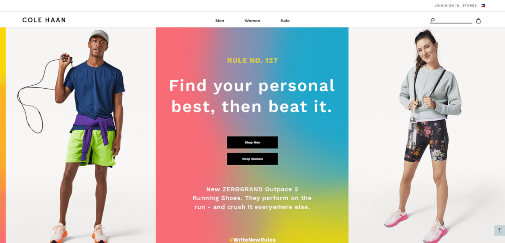
If the search term “leather shoes for sale” shows a lot of competing domains, you might want to optimize your content for a different search term. Good ones would be “handmade leather shoes for sale” or “affordable leather shoes for sale.”
However, if you’re daring enough to compete for competitive search queries, look at the highest-ranking commercial domains. Assess the content on their page, then try to replicate that with your branding and USP.
Consider the latest web trends
Keeping an eye on the latest web trends will help your website stay relevant and ensure that it doesn’t look dated.
You may take web design inspiration from the following sources:
- Competitors' websites
- Adobe Behance
- Creator Communities (i.e., Reddit, Discord)
If you feel iffy about taking inspiration from outside sources, you can remind yourself that there are no fully-original ideas—only existing ones that come with a new twist. In fact, many of these trends, such as adaptive design, exist because they work with users.
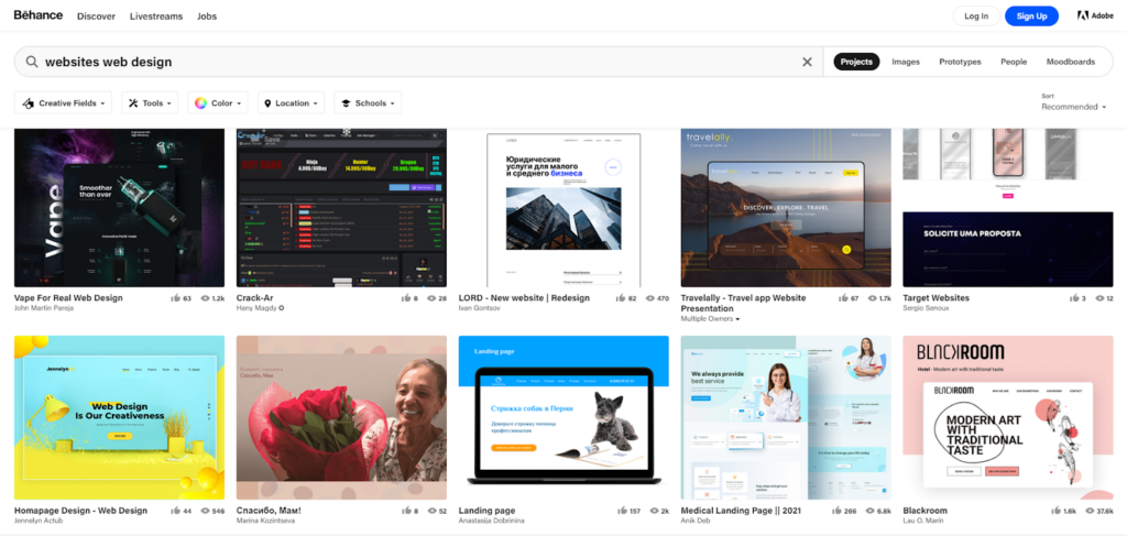
However, you don’t need to hop on every trend out there—just the ones that might be useful to your business. If a trend doesn’t fit your brand personality or doesn’t help your website function better, you shouldn’t feel compelled to apply it to your site.
Create your wireframes
Creating a wireframe allows you to see what your website will look like from the user end. It lets you see some rough edges in the design that wouldn’t be visible on paper. You may easily sketch one up, or draft it in Photoshop.
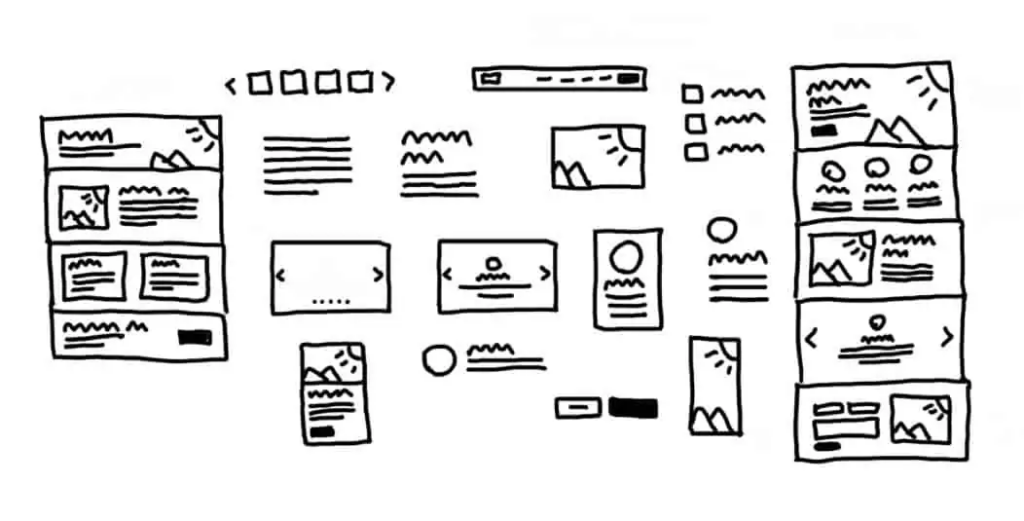
The wireframe accelerates the web design process since it allows non-web designers to see your work without going live yet. Use a tool review tool like zipBoard to gain optimal insight from different departments on what needs to be reworked. This gives you optimal insight from different departments on what needs to be reworked. By creating wireframes, you can play around with different combinations of web elements without the expense and hassle of rework.
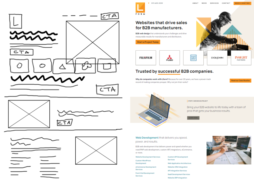
Every page should have a wireframe—your homepage, your about page, your contact us page, all those pages. You may even lay out your wireframes according to your sitemap on a corkboard. Connect the linking pages with red yarn to help collaborators fully visualize the mocked-up website.
After a couple of meetings with key personnel, you should have your final wireframes drafted.
Consider the User Experience (UX)
Key things to remember when optimizing your website’s UX
- Visually showcase USPs and features
- Use images and contrasting colors to highlight CTAs
- Make it easy to navigate
The process of navigating your website should be like flipping through a brochure or a menu. Particular types of typography call out key features, while images visually entice the viewer to a product or service.
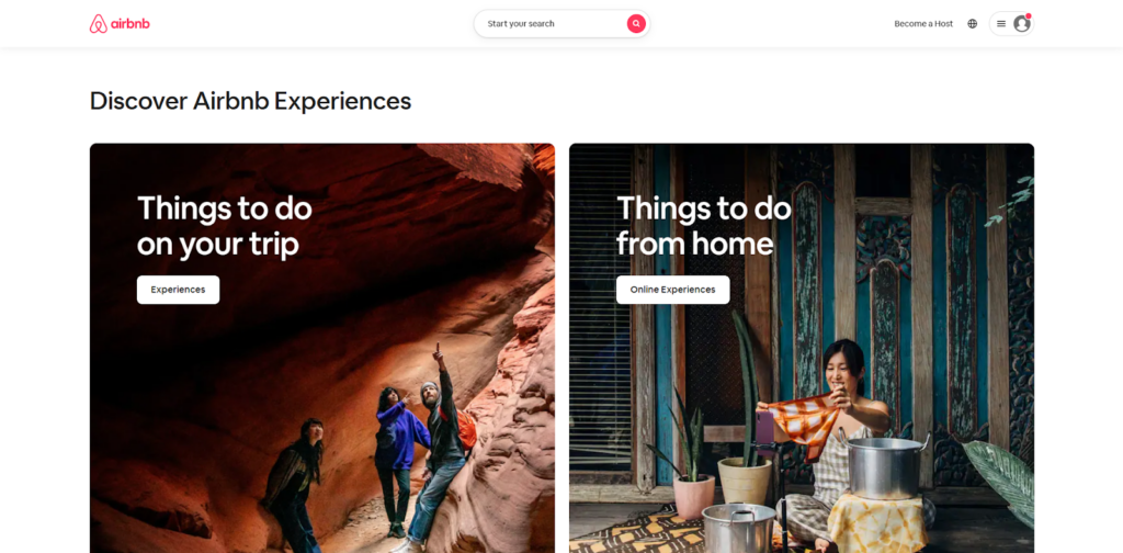
You’ll notice in the example above that most of the key elements are organized together. For example, the call-to-action (CTA) button is located right under the copy. The copy is also laid out to mimic the way a user’s eyes scan and understand text—in this case, from left to right and top to bottom. The website’s UX will also include the things that happen after the user clicks on the CTA.
When the user reaches the footer of your homepage, he should have a visual idea of what your business does, and what sets you apart from the competition.
Set your KPIs and make updates if needed
Once you’ve gotten a web design agency to bring your wireframes to life, you must see to it that you’re consistently monitoring your website. You can work with the best web design companies to create a website that meets your specific business needs. They will take into account your budget, target audience, and desired features to create a custom website solution. You may monitor these KPIs with Google Analytics and heatmap software.
KPIs differ depending on the objectives of the company. However, most web designers consider these the most important metrics to track:
- Heatmaps
- Scroll Distance
- Bounce Rate
- Returning Visitors
One can argue that daily traffic is also a KPI of a performing website, but a marketing campaign more influences that than the website itself.
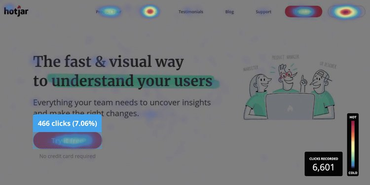
Seeing where users are hovering and clicking is a healthy indicator of what elements in your website draw attention. Heatmaps show this.
Looking into how far the average visitor scrolls determines your web page’s scannability, whether it’s too text-heavy or simply not engaging enough to be scrolled further.
A bounce rate is people who enter a restaurant, then leave as if they’ve entered the wrong restroom. A high bounce rate on your website may indicate poor page load time or a non-inviting homepage.

Returning visitors are a healthy indicator, especially if you don’t have a retargeting campaign in play. This means that something in your website must be striking a chord in your audience, making them come back for more.
Whether you’re editing the copy, the readability of the font, or the types of media, these KPIs will help you pinpoint what to improve.
Bonus: Website Redesign
As the name suggests, website redesign is the process of reworking on the website. The main aim of website redesign is to better its features, functions, and designs to improve SEO. The right period time to consider a a website redesign can be every three years. Still, a high percentage of websites require some improvements well before this period. Website redesign cost differs according to the method you chose and there are many factors to consider. You should discuss the requirements that you want to redesign the website to learn the estimated cost of different firms so that you can choose the best one that fits your budget or redesign it yourself.
Wrapping up
Creating a website is an absolute necessity for businesses in today’s online world.
When creating your website, stick to brand guidelines. What’s your brand color, personality, and tone? These should translate to the overall experience of your website via fonts, design elements, media, and copy.
Next, create your sitemap. This will serve as your blueprint. Then, research your competitors and assess the quality of their website. Know what search terms your competitors are ranking for so you can strategize whether to hop on another search term, or compete with them for that same search term. Look into trends as well to keep your website looking fresh, relevant, and up to date with the current competition in the industry.
Then, create wireframes for your website. This will help you visualize the user-end of your website and gather insights from other departments. Once your website is up, track your site performance against your KPIs.
Following these steps will get you a foothold on the digital online platform and ensure your business generates sales.
Featured image by Daniel Korpai via Unsplash

GOOD POST