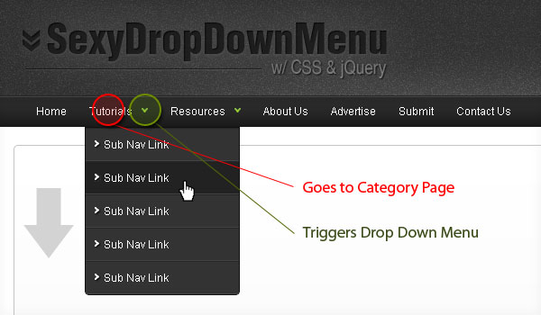
Sexy Drop Down Menu w/ jQuery & CSS
Studies show that top navigations tend to get the most visual attention when a user first visits a site.
Having organized and intuitive navigation is key -- and while most drop down menus may look aesthetically pleasing, developing them to degrade gracefully is also essential. In this tutorial I would like to go over how to create a sexy drop down menu that can also degrade gracefully.
According to this blog, CSS is becoming increasingly powerful, and with features like CSS grid and Custom Properties (also called CSS Variables), we can implement a lot of truly creative solutions. Some of these solutions aim not only to make the Internet more attractive but also more accessible, improve the experience of creating accessible styles.
The common user interface template we see on the Internet is a drop-down menu. They are used to display linked information in more detail, without the need for a large number of buttons, text, and settings. They are most often used for headline areas and site navigation. The best website builders even allow you to easily create a drop-down menu without coding.
Step1. HTML
First create an unordered list for your base top navigation. Then simply nest another unordered list for your sub navigation.<ul class="topnav">
<li><a href="#">Home</a></li>
<li>
<a href="#">Tutorials</a>
<ul class="subnav">
<li><a href="#">Sub Nav Link</a></li>
<li><a href="#">Sub Nav Link</a></li>
</ul>
</li>
<li>
<a href="#">Resources</a>
<ul class="subnav">
<li><a href="#">Sub Nav Link</a></li>
<li><a href="#">Sub Nav Link</a></li>
</ul>
</li>
<li><a href="#">About Us</a></li>
<li><a href="#">Advertise</a></li>
<li><a href="#">Submit</a></li>
<li><a href="#">Contact Us</a></li>
</ul>
Step2. CSS
Next, it’s time to style the navigation wireframe with CSS.ul.topnav {
list-style: none;
padding: 0 20px;
margin: 0;
float: left;
width: 920px;
background: #222;
font-size: 1.2em;
background: url(topnav_bg.gif) repeat-x;
}
ul.topnav li {
float: left;
margin: 0;
padding: 0 15px 0 0;
position: relative; /*--Declare X and Y axis base for sub navigation--*/
}
ul.topnav li a{
padding: 10px 5px;
color: #fff;
display: block;
text-decoration: none;
float: left;
}
ul.topnav li a:hover{
background: url(topnav_hover.gif) no-repeat center top;
}
ul.topnav li span { /*--Drop down trigger styles--*/
width: 17px;
height: 35px;
float: left;
background: url(subnav_btn.gif) no-repeat center top;
}
ul.topnav li span.subhover {background-position: center bottom; cursor: pointer;} /*--Hover effect for trigger--*/
ul.topnav li ul.subnav {
list-style: none;
position: absolute; /*--Important - Keeps subnav from affecting main navigation flow--*/
left: 0; top: 35px;
background: #333;
margin: 0; padding: 0;
display: none;
float: left;
width: 170px;
border: 1px solid #111;
}
ul.topnav li ul.subnav li{
margin: 0; padding: 0;
border-top: 1px solid #252525; /*--Create bevel effect--*/
border-bottom: 1px solid #444; /*--Create bevel effect--*/
clear: both;
width: 170px;
}
html ul.topnav li ul.subnav li a {
float: left;
width: 145px;
background: #333 url(dropdown_linkbg.gif) no-repeat 10px center;
padding-left: 20px;
}
html ul.topnav li ul.subnav li a:hover { /*--Hover effect for subnav links--*/
background: #222 url(dropdown_linkbg.gif) no-repeat 10px center;
}
Step3. jQuery
For those who are new to jQuery, you can learn about it here. The following script contains comments explaining which jQuery actions are being performed.$(document).ready(function(){
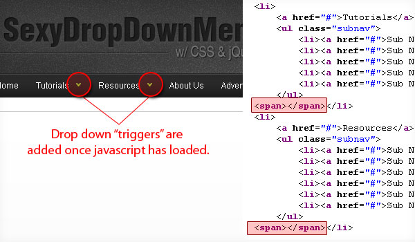
$("ul.subnav").parent().append("<span></span>"); //Only shows drop down trigger when js is enabled (Adds empty span tag after ul.subnav*)
$("ul.topnav li span").click(function() { //When trigger is clicked...
//Following events are applied to the subnav itself (moving subnav up and down)
$(this).parent().find("ul.subnav").slideDown('fast').show(); //Drop down the subnav on click
$(this).parent().hover(function() {
}, function(){
$(this).parent().find("ul.subnav").slideUp('slow'); //When the mouse hovers out of the subnav, move it back up
});
//Following events are applied to the trigger (Hover events for the trigger)
}).hover(function() {
$(this).addClass("subhover"); //On hover over, add class "subhover"
}, function(){ //On Hover Out
$(this).removeClass("subhover"); //On hover out, remove class "subhover"
});
});
*To degrade gracefully, we only show the drop down menu trigger to those who have javascript enabled.


this recopilation of tutorials is simply amazing! keep working hard. i’d like to suggest you to change the color of the form to submit comments to add more contrast; now it’s difficult to see
hey,
am copying everything same way u did but still can see same thing as in the picture above can anyone tell me please want to do dropdown navigation bar in any possible way!
Demo link is not working.
hi, for those who still looking for the demo:
http://www.htmldrive.net/items/demo/147/jQuery-Super-Sexy-Drop-Down-Menu
you can download the full zip file from:
http://www.htmldrive.net/items/download/147
Nice to see the different ways people implement menus, trying to get it the most semantic way they can, and without too many hooks.