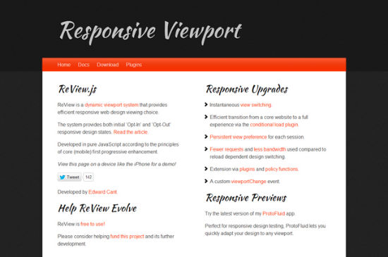
ReView.js Changes Viewports In Responsive Designs With a Single Mouse Click
Thanks to media queries, designing web layouts for different client resolutions has become easier. Not every visitor is satisfied with the situation though, as breakpoints and viewports set through media queries limit visitors to the target resolution of the device used. A new tool, written in JavaScript, gives visitors the opportunity to manually switch between the desktop and mobile view of the website at their own will. ReView.js is the new declaration of independence for web surfers.
 ReView.js
 ReView.js
ReView.js In A Word
The tool „Responsive Viewport“ – abbreviated ReView – has the single purpose of letting users on mobile devices change from mobile to desktop view. Often the mobile view is cut down not only in terms of layout, but also in terms of content, as there is not enough space on the small screen to transport all the information provided for desktop users. Using ReView.js the visitor can freely decide whether to see the mobile or the desktop layout. Looking at the ever-growing market of Android devices with its plethora of different sizes and resolutions, this makes perfect sense to me.How To Embed ReView.js
ReView.js is not dependant on any surrounding framework in the likes of jQuery or MooTools. To enable manual switching we integrate the JavaScript into the head-section of our website, right after the viewport definition:<meta name="viewport" content="width=device-width, maximum-scale=1.0, minimum-scale=1.0" />
<script type="text/javascript" src="ReView.js"></script>
All done. Now we can define a link for the switching functionality anywhere in the body-section of our HTML document. We have to assign the class review to that link as to enable ReView.js to find and process it:
<a class="reView" href="/">ReView</a>
If you're using a desktop computer, you'll never notice whether a website is ReView-enabled or not, as the tool shows the switch only on mobile devices. Visitors on mobile devices will see a link titled Default View. After the switch to the desktop view aka Default View, the link title changes to Core View. The layout changes occur without a reload of the page.
If you're like me and don't like the default titles, you'll be pleased to hear that they are not carved in stone and can easily be altered using HTML5 data-attributes like this:
<a class="reView" data-defaultText="Mobile Layout" data-coreText="Desktop Layout" href="/">ReView</a>
Conclusion: With ReView.js you leave the decision to choose between two given layouts to your visitors. The inexperienced among them don't get confused as the default view from a mobile device will always be the mobile viewport. So there are no downsides to the solution. Why not give it a try?
(dpe) 
AWESOME script!! Thank you for sharing it!
Potentially very useful script, but does not appear to work on my Android device.
Yes, this is great concept of ReView.js. It definitely helps any mobile user who visits the website. Users always like to find perfect information on website and the mentioned view port provides them full website review.
Hi Denis,
Thank you for the review of ReView :)
‘ReView.js is the new declaration of independence for web surfers’ is my favourite new tag-line.
I appreciate the comment on the default titles. I went for core/default because I felt that mobile/desktop is so tricky to draw a line between in terms of just screen size. I looked at it from a viewing experience standpoint. This will make more sense as ReView continues to evolve.
As you pointed out, I appreciate that most would not agree so I provided the data-uri overrides.
@Mikle Yes, the android experience is variable (down to browser support). ReView.js doesn’t get in the way on devices that don’t support it, so is still useful as a progressive enhancement on devices that do support the necessary features.
I’m working on improving ReView and adding plugins. It will soon be more robust and offer some very useful new features.
Thank you for the write up,
Edward, @opticswerve
Great script, thanks for sharing it Edward and for the write up Denis!