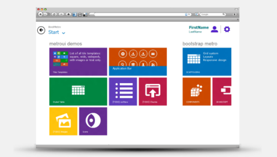
BootMetro: Framework for Websites in Windows 8 Design
We know you like tiled websites. Our article featuring Sergey Pimenov's Metro UI CSS drew loads of attention. So we thought you might also be interested in what the Italian frontend-developer Marcello Palmitessa created. By the name of BootMetro he just introduced a whole framework for building tiled websites in the Metro-style of the forthcoming Windows 8. Palmitessa took Twitter's Bootstrap and changed its looks to mimic Redmond's next-generation operating system. And yes, he not only got inspired by Pimenov's Metro UI CSS.


BootMetro: Based On Established Tools
As I said, Palmitessa not only got inspired by Metro UI CSS, but integrated and - probably - extended it. He also took HTML5 Boilerplate, Twitter's Bootstrap and fonts from IcoMoon. BootMetro is only a handful of days old and carries the version-number 0.5. As to the underlying design-principles, Palmitessa claims to be sticking to the official guidelines Microsoft provides. He is honest enough to admit that there might be space for optimization here and there. At the time being we find a completely restyled Bootstrap to fit the design of the elements used in Windows 8. All the styling has been done using pure CSS, later versions are planned to be using LESS for more flexibility. The roadmap states plans to develop more demos accompanied by their respective documentation, which at this moment looks like a slightly rewritten variant of the original Bootstrap docs. Palmitessa declares BootMetro to be free, but doesn't provide a dedicated license to clarify the issue. As Bootstrap carries the Apache-license it could be a fair guess BootMetro might be provided with a similar liberal license in the near future. If you ask me, I wouldn't consider building websites that mimic the design of Windows 8. An exception might be the creation of a dedicated web app for Windows Phone OS. The same would be true for pages in Redmond's own intranet;-) In other scenarios I can't imagine using a tiled, space-consuming design with a horizontal navigation hierarchy. You could easily get lost navigating more complex information architectures. But, as I mentioned before, our article on Metro UI CSS was very popular. So probably there are lots of developers with a different approach. Let me see what you built with Metro UI CSS or BootMetro. Have your say. Can you imagine building websites in Windows 8 style, are you planning to, did you do already?Related Links:
- BootMetro - GitHub
- Metro UI CSS: You can have a tiled website too - Noupe Design Magazine

But why would you want your website to look like Win8? :)
Yes
There are a few sites popping up here and there that use this Metro UI style.
Perhaps this UI style will catch on, perhaps not. Regards, it’ll be interesting to watch.
Examples:
http://wexa.1rent.ro/#
http://www.drewgreenwell.com/#
http://31daysofwindows8.com/
I think it looks cool.
Isn’t the third bullet supposed to be BootMetro?
I rather like the Metro UI look as well. Like Bootstrap, it’s clean, with a focus on content.
Very nice framework