Piet Zwart: The Rebellious Type
“Among the few I have indicated, is there no dynamic man of action, the rebel who will help determine the aspect of the collective expression of tomorrow? Ponder this question and know that to make beautiful creations for the sake of their aesthetic value will have no social significance tomorrow, will be non-sensical self-gratification. Every era contains the conditions for providing a rebel.”
- Piet Zwart
Portrait of a Rebel

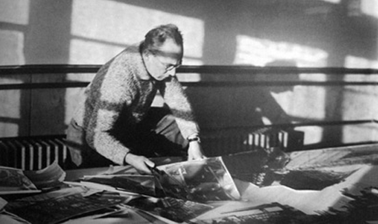
Piet Zwart working for Bruynzeel, august 1931 Image from 'Piet Zwart, vormingenieur' by Yvonne Brentjens
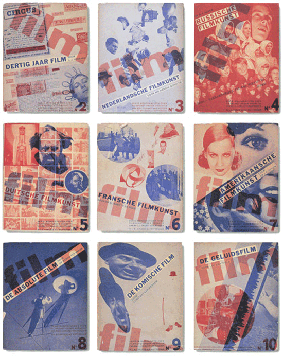
Personally, I admire the rebels, the forward thinkers, the people despised by society for being “different.” Zwart was, according to several sources, “not an easy man.” He was known for his “indiscretion” and many considered him “self-centered.” When have people like him ever been understood by the mediocre? Others recall that he was driven to excel. He worked late into the night, usually until three in the morning, set high standards for himself that others thought were unattainable by any person. He was concerned about promoting himself and paranoid about others having the wrong impression of him. As he was named The Most Influential Designer of the Twentieth Century by the Association of Dutch Designers (although some articles on Zwart list it as the Professional Organization of Dutch Designers) in 2000, he obviously succeeded in making his mark, despite the rumors and innuendos from those around him. Many, it seems in my research probably felt more out of jealousy from Zwart’s ideals of perfection and his insistence on being involved in articles and books about him. The Oxford Journal writes, ‘Yvonne Brentjens's new monograph… charts his struggle to arrive at an objective, scientific and technically perfect design, hence the word Vormingenieur (engineer of form).’ Piet Zwart was born on May 28th, 1885 in Zaandijk, North Holland (died in September 27th, 1977 at the age of 92). From 1902 until 1907 he attended the School of Applied Arts in Amsterdam where it is said there was little division between several disciplines as drawing, painting, architecture and applied arts. Zwart and fellow students developed by themselves with little interference from above, as teachers weren’t always present. "A smashing school with no idea of a program," as Zwart recalls. It was this lack of formal classroom training that led him to approach his design, especially typography in a fresh and untraditional way. While the purely horizontal grid design of straightforward type and images was the norm, leading to the Swiss School of Design in the 1940s and 1950s (also read the Noupe article on Swiss School designer, Josef Müller-Brockmann), Zwart felt his designing from his gut. As with most geniuses, there was a self-initiated method that broke the very same rules he had never learned, or, as I suspect, he cared nothing for and wanted to break. He also experimented in the use of photography incorporated into his designs, leading to photomontages. Still, with all the rule breaking and experimentation, Zwart was concerned with readability, feeling that typography should be clear and functional. If any influence must be assigned, he used the basic principles of constructivism and "De Stijl" in his commercial work.
Monografieën over Filmkunst book covers 1931
One must put Zwart’s work into context of the time and design influences. His use of type and montage was incredibly ahead of his time. Even today, such work is inspiring, fresh and unique. His lack of training shows a gift and inner creativity that is individual and comes from deep within. One has to wonder if Zwart's “difficult” personality, as nay-sayers put it, is a reaction to the misplaced and vociferous opinions of other contemporaries who couldn’t fathom Zwart’s designs. While time has proved him to be a truly great creative, it must have been hard for him to put up with life as the target of harsh critiques from charlatans and mediocre talents. It’s a great lesson for designers to understand that one’s own creative vision is not fodder for other creatives to comment upon. In the long run, history will be the judge of great creativity and not the opinions of others in the field.
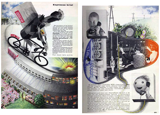
The book of PTT 1938
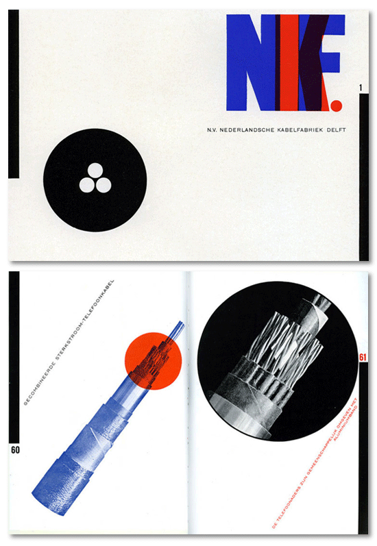
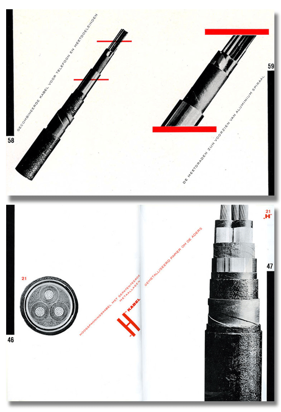
Zwart’s designs for a book for children on the Dutch Postal Telegraph and Telephone system. Sophisticated, fun and informative. It is an incredible visual, using his favorite bright palette and would be enjoyed by kids even today! He started his career as an architect and he worked for Jan Wils and Berlage. As a designer, Zwart was well known because of his work for both the Nederlandse Kabelfabriek Delft (the Dutch Cable Factory in Delft) and the Dutch Postal Telegraph and Telephone. Today, a designer might look at these as boring jobs but he had great leeway over his creative output and that is yet another lesson he has for modern designers – you can take the most mundane item and make a beautiful design. Can you imagine a cable and wire company today allowing such design for their catalog of products? Perhaps Zwart’s work can be used as an example of the excitement that can be mixed with any product?

NKF catalogue
He ended up resigning from NKD in 1933 to become an interior, industrial and furniture designer. Perhaps it was his restless nature or perhaps just his desire to self-improve and his yearning to find something just out of his reach. Another lesson to us as we should always try to reach new heights with our design and never settle for the easy path but to keep searching our creative nature to improve ourselves and our design. Zwart had been fired from the Rotterdam Academy of Fine Arts in 1933, after he had been quite explicit about the redevelopment of art education. Some say he was teaching communist ideals to his students and some say his progressive ideas had been closely linked to the innovative methods and objectives of the Bauhaus School in Dessau where he was asked to host a number of lessons in 1929. Oddly enough, the very school that fired him was renamed after Zwart -- The Piet Zwart Institute of the Willem de Kooning Academy Rotterdam. Times often change after it’s too late for the individual. It may have been these personal battles, his inner id being challenged by the industry as well as himself that led to a brilliant madness that drove incredible, ground breaking creativity.
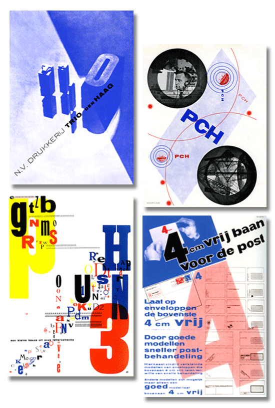
4cm vrij baan, poster for PTT, Trio-Reclameboek cover and inside-page
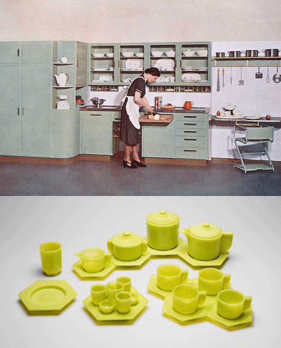
The kitchen he designed for Bruynzeel in 1938 is a good example. It was highly progressive for its time. This was the first time that domestic appliances like a refrigerator and stove could be integrated in the design in a practical way. All the elements were designed with logical proportions, and customers could combine them as they wished. Handy details like glass containers, a pull out breadboard and storage racks made the kitchen a textbook example of comfort and efficiency. His apple-green pressed glassware compact as tubular tea cups that sit in interlocking hexagonal saucers. ‘The emphasis on form rather than decoration,’ according to an article in New City Art, says, ‘ not only severs ties with the clutter of the Victorian past but identifies everyday items with the values—efficiency, durability, mass distribution—of emerging industrial and communications technologies.’
bruynzeel kitchen
Early Ikea? Again, think about the time when this was designed. It was incredibly futuristic and set a standard that is still used today. As with many who lived in the dark days of the Second World War, Zwart, along with 800 other prominent citizens were arrested and held by German soldiers. After the war, when he was released from captivity, he mainly focused on industrial design. One can only imagine what years of captivity did to him. He never spoke of those years. It is amazing he went back to creative work, albeit in another field. One cannot have much introspection into a person’s private pain. The old saying is that an artist must suffer for their art. Zwart certainly suffered although it’s hard to tell how much of it was self-imposed. It is, however, his legacy of creativity that lives on and has lessons for the creatives of today. His drive and dedication to his vision is a great lesson. His work, if one thinks of the time and culture of his heyday, was such a departure – almost futuristic but he still managed to convince people that his vision was the best way to communicate the message. As mentioned in this article, he was dedicated to creating a clear and vivid message for the end user. He succeeded on his own terms, despite a stumble in his career, here and there but that only propelled him farther into fame. Our lesson is that little stumbles or failures, if they can be called that and not life lessons, should always push us further into creativity while understanding the work is the most important factor. It is, after all, the legacy of our names that we will eventually leave behind. (rb)
I did a project on Piet as my final for my History of Graphic Design class. The project really forced me to step out of my comfort zone and experiment with disassembling conventional ways of looking at type and layout. We had to create a piece that mimicked his style, and if I may pat myself on the back, I think my piece was pretty spot on. Thank you for taking the time to write this article, it was a great read.
~J
thanks again for another excellent article … and the introduction to a great designer!
more please :)
I believe it is really important for designers today to look back at the history of design and study the designers who challenged the popular perspective of the way the world works and made their own language to explain their unique and individual perspective. Without these important individuals, art and design would never advance and the graphic designer today would still be struggling towards something unexplainable. This article is a well-written reminder of this and inspires me to push the envelope to move our perspective of the world forward and create a new art and design.