Viewport Resizer: Extremely Flexible Bookmarklet Lets You Test Different Resolutions Easily
A web designer's tasks are far from getting easier. More and more different resolutions come to market and have to be addressed in professional layouts. The formerly rather simple distinction between a site for mobile and another for desktop users is not sufficient anymore. With the success of smartphones of the most different sizes the problem grows bigger by the hour. Of course we have media queries to address different resolutions properly. And even though they do work in the majority of cases you still have to test them properly.
 Viewport Resizer
 Viewport Resizer's two standard bars
Once embedded into the bookmarks bar, Viewport Resizer waits for its mission. If you want to test a website, you call it's URL, wait until it's fully loaded and then click the bookmarklet. A little toolbar appears at the top of the page, showing the available resolutions or devices. Click on one of it, the browser windows gets resized accordingly.
This way you can quickly test the different break points and their intended operation. If you are developing for special resolutions you can easily customize the values behind the icons in the toolbar.
 Device Selection and Result Editor
 Viewport Resizer
Viewport Resizer As A Bookmarklet
The web app Viewport Resizer is one of the little helpers invented to make a designer's life easier. You simply drag the little tool to your bookmarks-bar and have it at your finger-tips from then on. The bookmarklet comes in two default configurations, which you alter and extend quite easily. The first standard brings numerous resolutions for smartphones, tablets, monitors and several Apple devices. The second default configuration delivers support for iOS-resolutions only. Viewport Resizer's two standard bars
Once embedded into the bookmarks bar, Viewport Resizer waits for its mission. If you want to test a website, you call it's URL, wait until it's fully loaded and then click the bookmarklet. A little toolbar appears at the top of the page, showing the available resolutions or devices. Click on one of it, the browser windows gets resized accordingly.
This way you can quickly test the different break points and their intended operation. If you are developing for special resolutions you can easily customize the values behind the icons in the toolbar.
The Toolbar Can Be Customized Individually
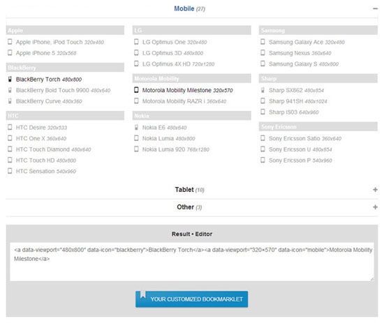
If the two standard configurations are not covering your individual needs, you can always create more with devices and resolutions you define. Besides showing generic resolutions, Viewport Resizer comes with a small amount of predefined devices also. You will find HTC, Nokia, Sony Ericsson, Motorola and more. If even these possibilities don't suit you you fire up the built-in text editor and feed Viewport Resizer with values to your own liking. You define resolutions, name them and even put icons to the choices. That way you create your own toolbar which can be used as your own bookmarklet, just like the default bars can. Device Selection and Result Editor

Great tool! One of the best I’ve seen for viewport resizing.