Better than Pure CSS3: Realistic and Complex Shadows with Shine.js
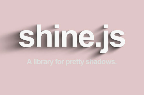
Thanks to CSS3 there are several possibilities to apply shadows to elements. We have text as well as element shadows, and even a shadow filter exists. Unfortunately all CSS3 shadows are limited to simple drop shadows, where you can define its colour, its blur, the offset and the size. The new JavaScript library offers many more features to let you create much more realistic and complex shadows with Shine.js.

 Example for our German Brother "Dr. Web Magazin"
To apply the light source to the defined shadow we need to redraw the shadow via „draw()“.

Producing Shadows
Shine.js by Benjamin Bojko and Naim Sheriff comes without further dependencies. No other JavaScript, first and foremost no jQuery, nothing. This autonomy makes it perfectly easy to integrate into any given project. Once the tool got embedded through the head of your document, you can start to invoke shadows on just about anything your page contains.var noupeshadow = new Shine(document.getElementById("headline"));
Using „Shine()“ we always define a new instance. Besides attaching an element, several parameters are optional to be defined. We have a configuration parameter available to design the looks of our shadow to-be.
var noupeshadow_config = new shinejs.Config({
  numSteps: 10,
  offset = 0.25,
  blur: 100,
  opacity: 0.5,
  shadowRGB: new shinejs.Color(255, 0, 0)
});
var noupeshadow = new Shine(document.getElementById("headline"), noupeshadow_config);
In the above example we use „shinejs.Config()“ to define a shadow which will be turned over to the „Shine()“ instance as its second parameter. As you can see, there are several ways to fine tune the shadow's looks. „Shine.js“ then generates the shadows using the CSS3 properties „text-shadow“ for - well - text shadows and „shadow“ for element shadows. Via „numSteps“ we set the number of shadows that will be applied to the given element. Rule of thumb, obviously: the more shadows you apply, the more complex the impression of the shadow gets. Via „offset“ we define the offset, via „blur“ the - you guessed it - blur. The parameter „opacity“ has direct effects on the opacity and „shadowRGB“ takes care of the colour, which is defined via its own instance of „shinejs.Color()“.
Placing the Light Source
What's special with „shine.js“ is, that you can define individual light sources for each shadow per their x and y coordinates.noupeshadow.light.position.x = 500;
noupeshadow.light.position.y = 10;
noupeshadow.light.intensity = 1;
The bigger the coordinate values, the longer the shadow gets. Besides „light.position.x“ and „light.position.y“ for the mentioned coordinate definitions, „light.intensity“ controls the - well - light intensity. The higher its value, the stronger the shadow.
 Example for our German Brother "Dr. Web Magazin"
To apply the light source to the defined shadow we need to redraw the shadow via „draw()“.
noupeshadow.draw();
Applying Shadows to Elements (Instead of Text)
Per default shadows will be applied to text. To achieve this we enclose the letters using the „<span>“ element. Each of these elements can have its own class prefix - optionally, that is. If you do, you can add more CSS individually.var noupeshadow = new Shine(document.getElementById("headline"), noupeshadow_config, "prefix");
If you don't want to apply the shadow to a text, you can as well target any element. To achieve this, we attach „boxShadow“ to the „Shine()“ instance as its fourth parameter.
var noupeshadow = new Shine(document.getElementById("headline"), noupeshadow_config, "prefix", "boxShadow");
Remember, if you don't explicitly add „boxShadow“, it will always read „textShadow“, even if you didn't apply it.

Great post. I heard first time about Shine.js. Learn lots of new things from the post about Shine.js. Thanks for the share.