Web Design Trends: Testimonials Design
Testimonials from happy clients are an important part of any service business's website, lending trustworthiness and experience to a business. Showing those testimonials in their best light is important, as you want visitors to see them without allowing them to dominate your site's design.
One great way to figure out how to design the testimonials on your own projects is to look at how others are doing it. There are five predominant trends in testimonial design: speech bubbles, quotation marks, images or icons, minimalism, and video. Read on for information about and examples of each, and some bonus best practices at the end.


1. Speech Bubbles
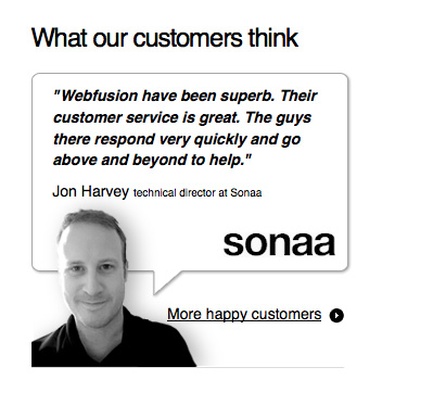
Speech bubbles create an informal, friendly atmosphere in website design. Some sites use them to surround the entire testimonial, while others might use them around an image or as an icon. In any case, they immediately set apart the text or image inside, and make it recognizable as a quote from someone.


2. Quotation Marks
Quotation marks are another way to indicate that nearby text is something someone said, and are a bit more formal than speech bubbles. They're more appropriate for corporate sites when done in a traditional font, though using funkier fonts can make them look informal and fresh.


3. Images, Icons, or Other Graphic Elements
Displaying an image next to each testimonial is a popular trend in testimonial design. The image could be a photo of the person who gave the feedback, the logo of the company the work was completed for, or an icon or other graphic element that sets the text apart from that around it.


4. Minimalist
A lot of sites display their testimonials using a minimalist style, usually with plain text, often italic, set near other text blocks of similar shape and size. This is the most subtle method of displaying testimonials, and works best on a site that has a minimalist design, otherwise the testimonials can get lost on the page.


5. Video
Video testimonials are a fairly new trend, and make a lot of sense for sites catering to tech-savvy clients. Video testimonials add another layer of trust that straight text doesn't have; people will naturally trust hearing and seeing someone vouch for a product or service — rather than just reading about it. After all, as far as the visitor is concerned, your testimonials could be fabricated. Video is a lot harder to fake.


I provided a great testimonial (following this website guidelines) to our building management agent which they use on their website. In the meantime their service has been rather dreadful and my satisfaction shattered to pieces. Can I ask them to remove my testimonial from their website as it does not reflect my sentiment any longer. Many thanks. BD
we are looking to redo the style of our testimonial page and are up in the air – this page REALLY helped us with some ideas…thanks!
u are great
Thanx!!! The ideas shared to display testimonials was of great help.
Good work
It’s true that a picture can make a testimonial so much more powerful. Video? Not sure. You’d have to be really interested in what one has to say about the company to watch a video testimonial. With text I have an option of scanning through to decide whether I want to read in full while video does not give me this possibility.
Thanks for taking the time to create an excellent resource.
Thanks for the insight.
Yes, testimonials for me have become an important facet in my industry for the over 55’s, in providing consumer confidence in the equity release product we advise on.
Combining this with the latest video’s on offer can present a powerful confident image we can portray.
Question now is where do I find the best video production company? Any ideas plz?
Many thanks in anticipation…