Showcase of Excellent Graphic Email Newsletter Designs
Sending email newsletters is an effective way of marketing and communicating with your clients and customers, and can serve you best when designed properly to attract potential customers, as well as the attention of your existing customers. Email newsletters are a powerful medium to maintain an extra connection with your audience beyond just the reach of your website alone.
[fblike]Email newsletters allow you to keep your clients and customers in the loop with latest things that are happening, and products to pay attention for. In this way, you can build a healthy relationship with your customers and can significantly increase your sales. Now get a load of these exceptional Graphic Email Newsletter Designs for your inspiration.
Showcase
Heroes Over Europe
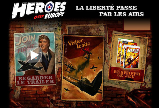
This is one of the most creatively and skillfully designed newsletters in the showcase, which truly stands out among the rest.
Percept Brand Design
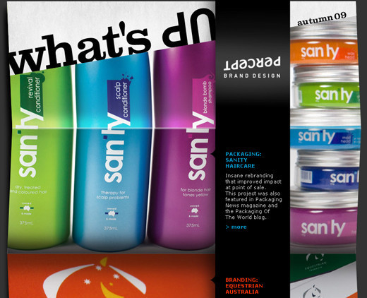
A creatively designed newsletter created keeping the target audience in mind. Sufficient space is allotted for the content as well.
ScrapBlog
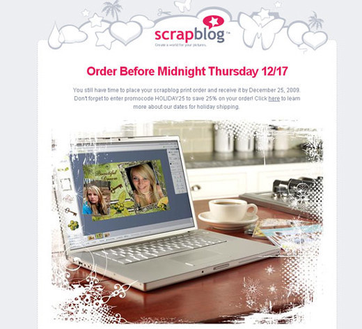
Very well designed newsletter that not only attracts the customers with its alluring graphics but also informs them in detail about the ScrapBlog.
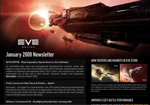
EVE Online
This is one of the best newsletter designs in this collection that uses high quality and visually alluring graphics to grab the attention of their potential customers and buyers.
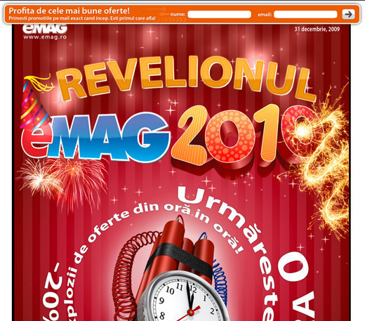
eMAG Newsletter
This newsletter brings extremely high contrast colors and top notch quality graphics into play that will for sure grab the attention of onlookers.
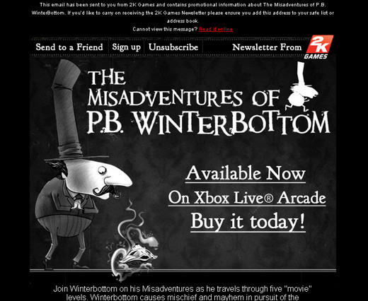
The Misadventures of PB Winterbottom
To portray the dramatic nature of the game, a dark black theme is chosen for this newsletter. Furthermore, customers are also informed that it is available on Xbox Live Arcade.
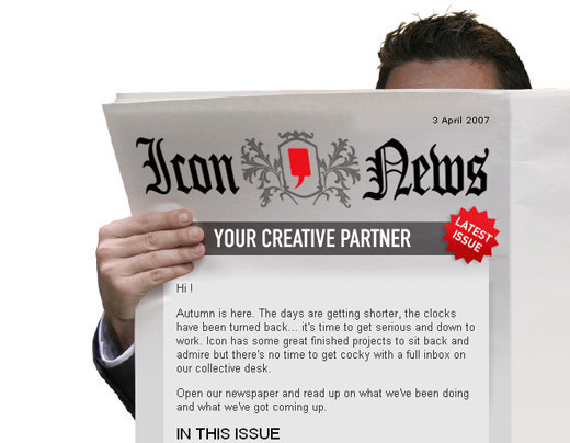
Icon Inc.
This newsletter design perfectly matches with their tagline “Your Creative Partner”. The newsletter is actually presented as if you are reading a newspaper.
Think
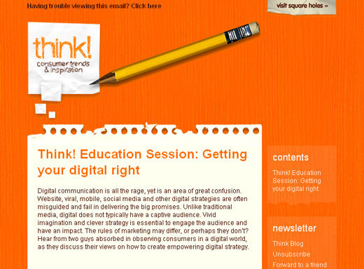
The main content area is highlighted against the vividly colored background so that visitors do not get distracted and read the entire newsletter.
Bioshock
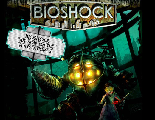
The use of high quality graphics in this newsletter is making it stand out from the rest in this collection.
Dress Up Diana
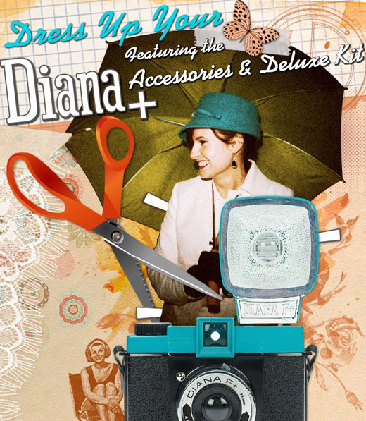
The adage “A picture worth thousands words” best defines the nature of this collage like newsletter design.
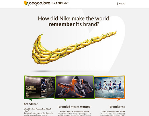
Brandtalk
A simple and memorable design for the branding purpose. Here, Brandtalk used a unique approach to represent Nike’s logo.
Sephora
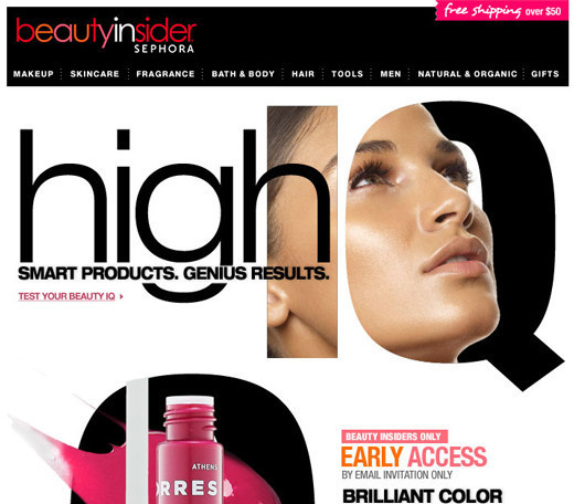
A wonderfully designed newsletter for promoting beauty products. The use of excellent graphics and color contrast helps in making this newsletter more appealing and stylish.
Paul Frank Industries
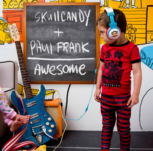
Excellent use of graphics to call attention to their flat rate shipping.
Elizabeth Davis
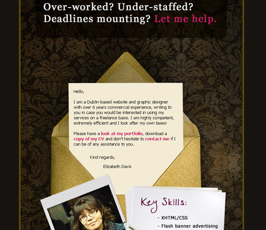
This newsletter is started with a catchy line that not only grabs the attention of the readers but also makes them read the entire newsletter to find to the solution of their problem.
Manual Design
In this design, you can see that more emphasis is given to the content of the newsletter rather than the images, yet it looks visually startling.
Urban Outfitters
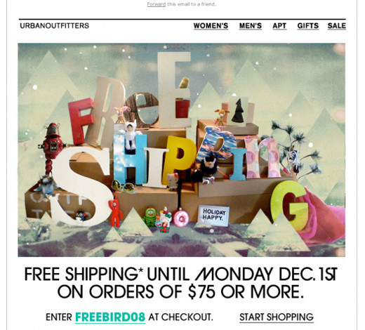
This newsletter is primarily intended to market their limited time Free shipping campaign, and therefore is designed accordingly.
Threadless
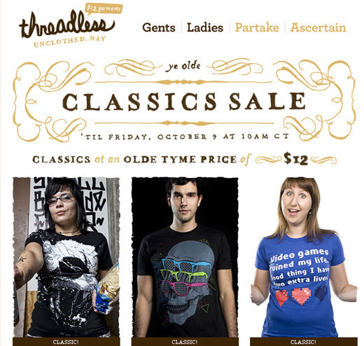
With this newsletter, Threadless is promoting their Classics Sale. By specifying the date this sale will end, they urge the customers to avail themselves of the offer right now.
Action Method
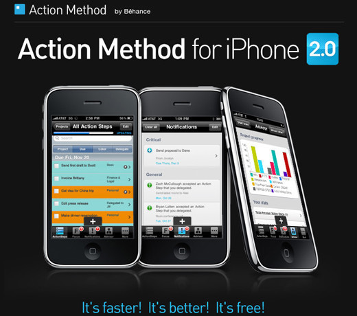
iPhones are everywhere and it is quite difficult to cater to such a huge market with a single newsletter but Action Method has successfully accomplished this difficult task.
Paul Frank Earth Day
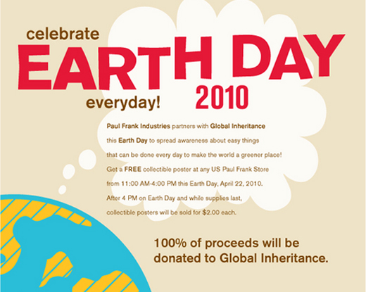
Simple graphics with the detailed information on the celebration of Earth Day.
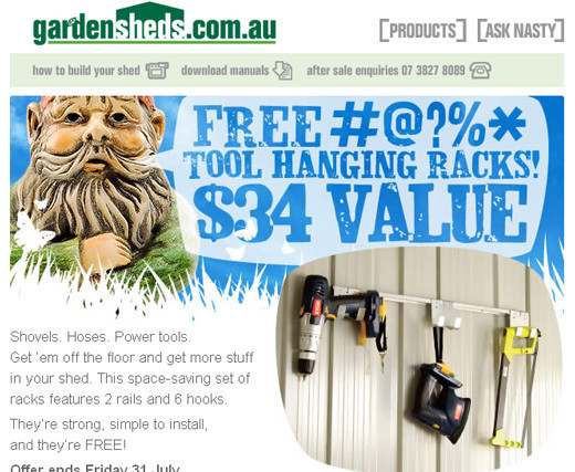
Garden Sheds
Garden Sheds uses lots of color variation to give this newsletter an eye-catching look. The content of the newsletter is the main area of focus.
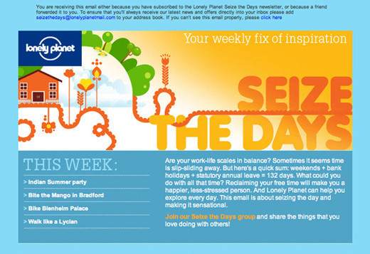
Lonely Planet
Light refreshing color is used as the background for this newsletter design that is pleasing to the eyes. The purpose of the newsletter is defined with the help of supporting text placed beneath the image.
Juxt Interactive
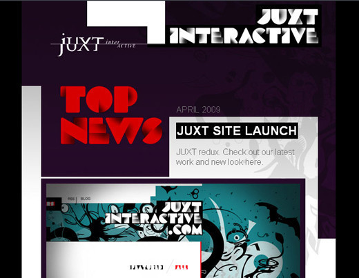
Not much content is placed in this newsletter rather Juxt Interactive puts lots of emphasis on the graphical elements.
IrelandHotels
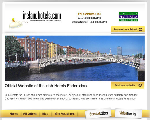
With a breathtaking look at Ireland accompanied by the necessary details on going, there is enough in this newsletter to attract potential tourists to check out the hotel for their next trip for sure.
ExpoLit09
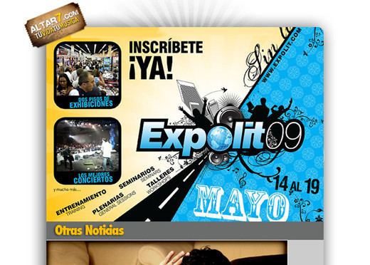
Use of high contrast color combination compels the visitors’ eyes drawing them to the content of the newsletter.
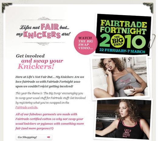
Life’s Not Fair But….My Knickers Are
Since the newsletter is about a feminine brand, the newsletter is also given a very feminine look by using loads of pink shades.
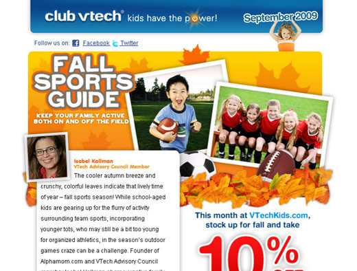
Club VTech
This newsletter is also designed keeping the target audience in mind i.e. kids. Therefore, they use graphics and images that will appeal to youngsters.
Owl City
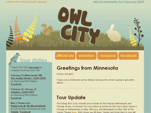
Here, you can notice a more sophisticated and professional approach is being taken to impress the potential clients. Visitors are thoroughly informed about each and every thing the company has to offer.
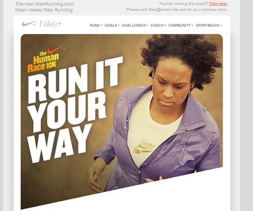
Nike – Run it Your Way
Nike like its simple and effective logo design created a neat and visually attractive newsletter that fulfills its primary action.
Nation Toys
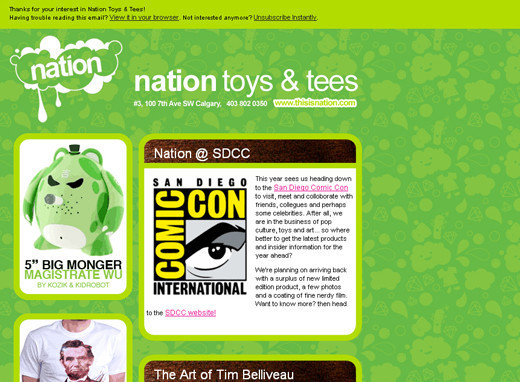
A funky design that is well suited for the toys outlet. This one would definitely appeal young children and teens alike.
Totally Rad
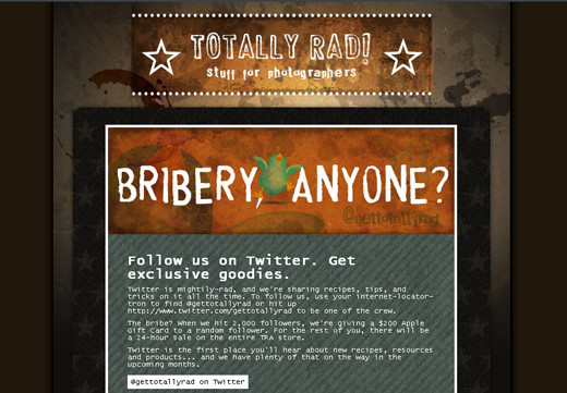
Loads of information is provided with this newsletter to inform visitors how they can follow Totally Rad on Twitter and get special goodies.
Envato
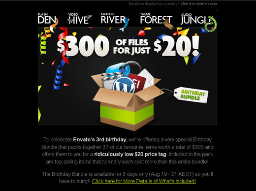
Envato captures the attention of their prospective clients with unbelievably amazing graphics. You can see that the content is not being highlighted much.
Indiemark
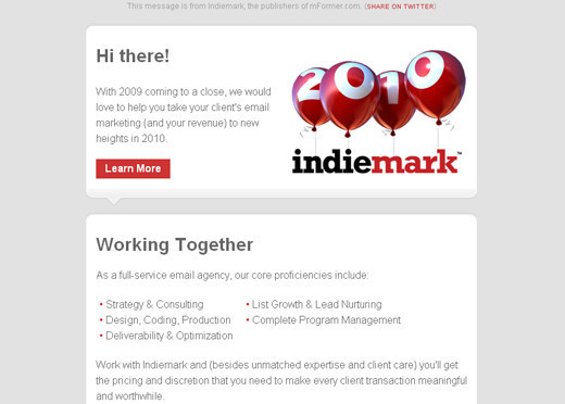
A very cool and soothing design that mainly focuses on the content of the newsletter.
Fitness 5022
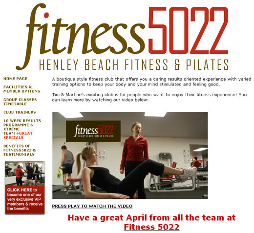
Fitness 5022 has incorporated a fitness video to give their visitors an idea of what they can expect if they join Fitness 5022.
Ragged Edge Design
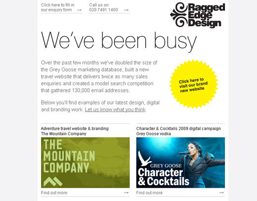
Ragged Edge Design makes use of a sophisticated template that equally puts emphasis on the graphics and content of the newsletter.
Bonobos
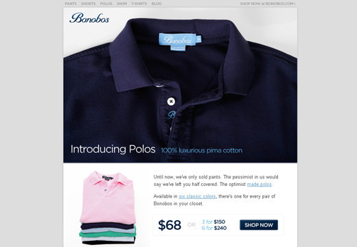
Bonobos follows a unique marketing approach in this newsletter by showing a high quality picture of a shirt to give an idea of the quality of the product and then they follow up with how you will be entitled to a huge discount by purchasing in bulk.
Apple iPod summer accessories email
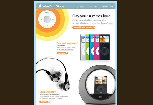
Again in this newsletter, graphics are emphasized more as compared to the text.
Making Ideas Happen
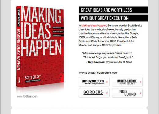
Here the white space is used for this newsletter to more effectively highlight the content along with the places you can get this book from.
Paul Frank Newsletter
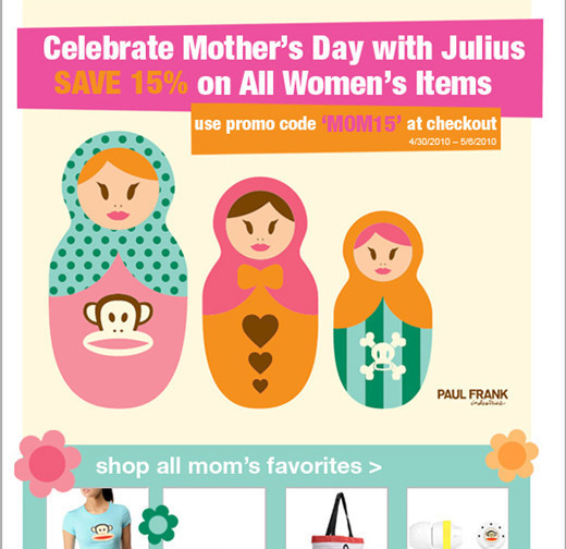
Paul Frank always sends prompt newsletters associated with any recent or upcoming events. Here, they are celebrating Mother’s Day by offering all of Mom's favorite items at a discount.
Australia Post
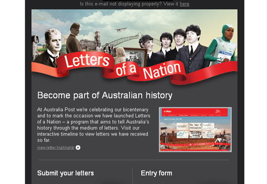
A simple but effective design that executes its purpose even without the use of much content and images.
Pizza
A yummy and delicious pizza on the plain background in enough to captivate the onlookers.
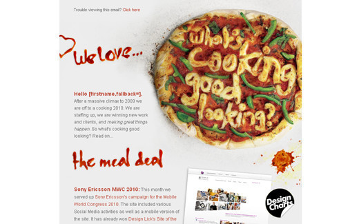
ADC Young Guns
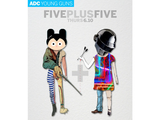
An extremely artistic approach that uses bizarre graphics against simple grey background to perplex the potential customers and make them read till the end.
Apple
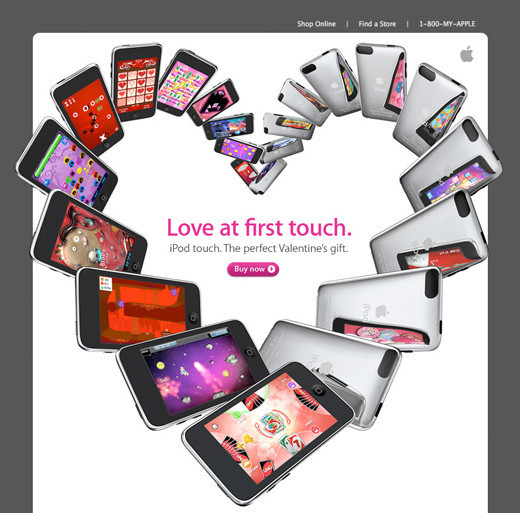
Loads of Apple iPhones are placed in the shape of a heart to exemplify the love that we all have for the device. Imaginative use of beautiful graphics.
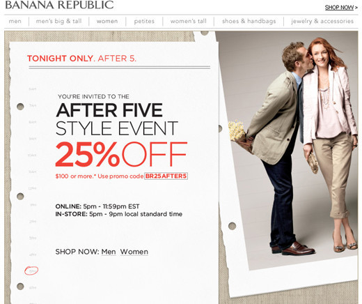
Banana Republic
Main area to be focused here is their offer that says 25% off after the five style event. Banana Republic is quite clear on what they want to be highlighted as their best selling point.
Bing
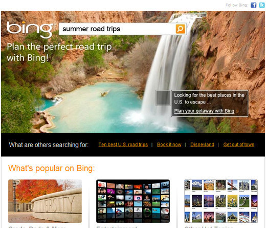
Bing introduced lots of new things in the word of the internet and here with this newsletter they invite their users to find out what’s popular on Bing.
Miche Bag
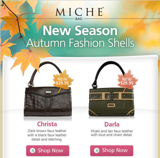
A well suited template design for the offer being given through this newsletter. Very well thought out and executed!
Jon Burgerman
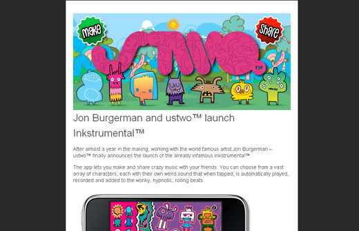
Equal importance is given to the content and graphics to grab as many customers as possible. The huge empty space highlights the content.
Made
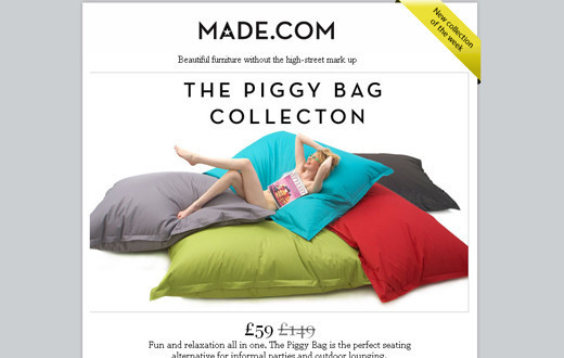
High contrast color graphics are placed against simple and white background that make the graphical elements shine.
MapMyRide.com
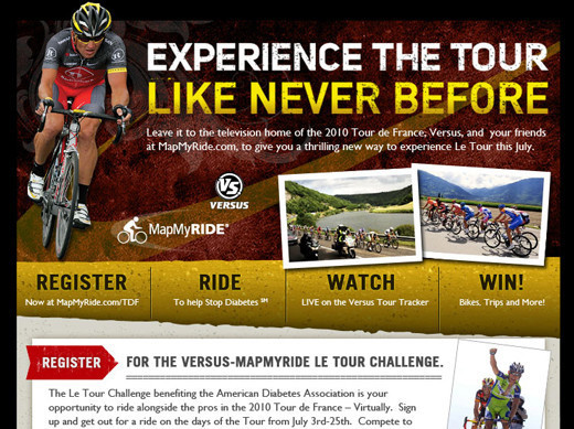
The excitement of cycling is the focus here. The appealing graphics and catchy tagline are the key components of this newsletter design.
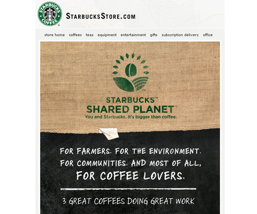
StarbucksStore.com
A subtle approach is taken in this newsletter design. It is neither over loaded with the graphics nor with content. On the whole it is a decent approach.
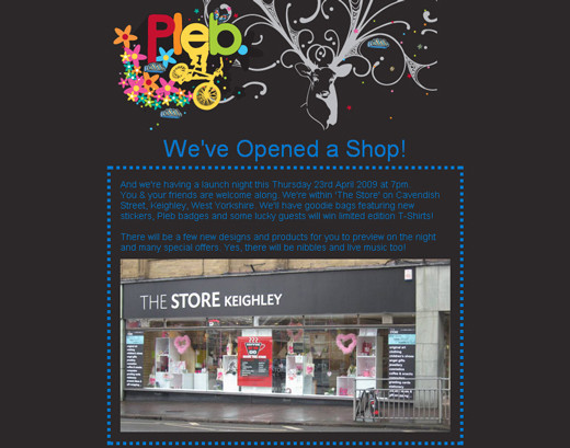
The Plebs
The snapshot of their recently initiated shop is placed against a black background in order to call attention to the shop only.

I quickly scrolled through this before even realizing these were email newsletters. They’re awesome! Nice list!
Email newsletters despite being a useful and convenient way to advertise can often be ignored by viewers as being spam so in order for them to be really effective the design has to really stand out from the crowd and capture the viewers interest. I think the key to a successful email newsletter is for it to be functional like a website but for it to have the visual impact of a printed design. I think there are some really interesting designs here that work well.
While these designs are pretty nice, do we know how well they performed in terms of opens, clicks and conversions? These are the true tests of how ‘excellent’ an email is, not just the design.
I do agree with Flo59 & nik that these are mainly just pretty for pretty’s sake, and without metrics it’s difficult to tell which are really good. Plus, most are missing a decent Call-to-Action.
That being said, I love the simplicity of the Bonobos one, very sleek.
I would love to see an article like this that also covered the ROI and A/B testing results!
Heroes looks awesome!
Thank you for showcasing one of our newsletters (Heroes Over Europe) we create for Ubisoft EMEA since 2002.
It’s true that effective newsletters must contain texts and not only images. But for video games editors like Ubisoft, it’s different because they must sell a graphic universe and not only information. After many A/B testings, 100% image newsletters obtain better ROI than HTML/images in that specific case.
some nice graphical designs, not too sure they’re good newsletters though as a lot of them are light on text and big on images.