UICloud: Brand-New Free Resource Covers More Than 25,000 UI Elements
UICloud is a fresh project. Launched in July 2012 it already provides over 25,000 UI Elements in over 1,000 UI sets. All the resources can be used free of charge, individual licenses apply. Jack Cai, a Southampton (UK) based Chinese freelance icon and GUI designer, did a great job. The platform is intuitive, even fun to use. The design is modern and elegant, the content is neatly arranged. Enough reason to look deeper into it.
UICloud: The Starting Point
Chances are, the first page you'll navigate to is the homepage. My first thoughts on the layout had me believing Google just had a redesign. The similarities are evident: a big search-box in the middle, a dark navigation-bar on top of the browser window, a button entitled "Search". But, why not, usability is nothing you'd have to invent on a daily basis. The simplistic design works well for Google and it works equally well for UICloud.
[caption id="attachment_72975" align="alignnone" width="550"]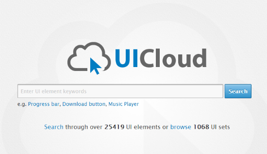 UICloud's homepage[/caption]
From the homepage you can go several ways to explore the content of the service. First you could use a free search term to see what UICloud has to offer. That way would be the fastest road to success given that UICloud returns results. I tried that with the search term Metro and was as successful as can be. The fabulous Metro UI CSS showed up as well as the brand-new BootMetro framework. Note that I took a rather specific search term intentionally. I wanted to see if UICloud works well in niches too. If you enter a term like "progress bar" you will be overwhelmed by the amount of results.
[caption id="attachment_72977" align="alignnone" width="550"]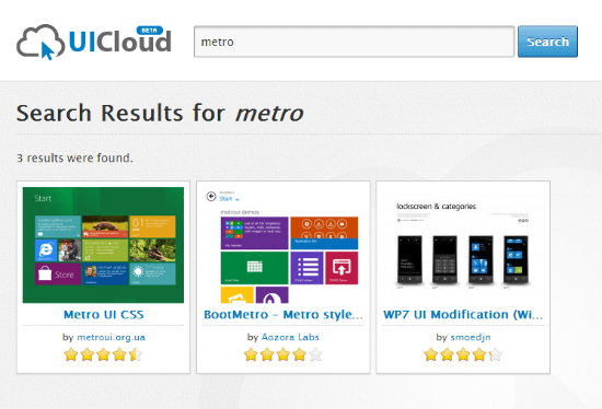 UICloud: a sample search result[/caption]
Leaving the homepage the search-box doesn't go away but shrinks a little and can be found at the top of every other page right under the navigation-bar.
UICloud: Exploring Contents Besides The Search-Box
If you're not into searching but more into exploring UICloud has you covered too. The Browse functionality lets you stroll through the available UI sets. The sets are presented with only the most essential information and a scaled-down screenshot on a four by six matrix. You can sort the sets to see the latest submissions, the top rated contributions or the most popular by downloads. 45 pages packed with nearly 1,100 sets will have you kill your time easily.
[caption id="attachment_72967" align="alignnone" width="550"]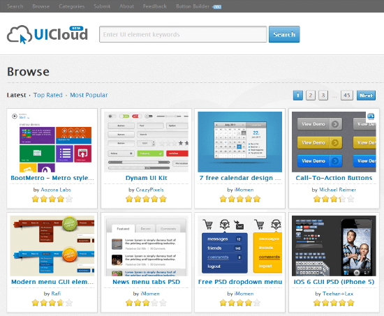 UICloud: browse the latest and greatest[/caption]
You don´t have time to kill or are looking for specific resources, say Android-UI elements? UICloud's category-view is for you. This view shows you the contents of the service in a structured manner, using categories such as Android, Apple, Windows, PSD and others. The choice of categories could be a matter of argument as they are not necessarily all too obviously helpful.
[caption id="attachment_72971" align="alignnone" width="550"] UICloud: the category view[/caption]
Inarguably beneficial is the second possibility of category-navigation. Here UICloud sorts elements according to their use cases, such as buttons, forms, sliders, switches and more. The third possibility speeds up searching for developers who need that last little element, but in a specific colour scheme.
[caption id="attachment_72972" align="alignnone" width="550"] In need of a specific color scheme?[/caption]
UICloud's Single View: All Necessary Facts At A Glance
No matter which way you choose, at the end of your journey through UICloud you'll be presented with an informative one-page overview to the set you had been looking for.
[caption id="attachment_72974" align="alignnone" width="550"]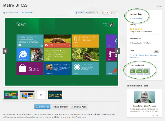 UICloud's single view: all necessary info at a glance[/caption]
The overview shows one or more large screenshots of the element or set to the left-hand side of the screen. If there is more than one screenshot, the rest is presented in the form of a small thumbnail gallery below the initial picture. To the right-hand side you find essential information as to under which license the element is distributed and which formats and files are included in the download.
Be sure to always check the license. Just because all of the provided elements are free to use doesn't mean they are free to use for all use cases. Our example element Metro is given away under the absolutely liberal MIT license while others are only free for personal or other non-commercial use. The popular star-system is used to have the elements rated by the visitors, statistic-freaks see the number of downloads and views and the tag-section shows the appropriate tags used to find the resource and group it with others. The tag-section can be edited freely by every visitor, a double-edged solution.
Links for downloading the resource, live-previewing it or heading over to its original source page are placed below the screenshot area. All the resources are hosted on UICloud's server space, which makes them resistant to anything that can happen with externally linked-in content. If you are in doubt however, that the resource may not be the most recent version you can always double-check over at the source page.
Just as in any blogging environment you can leave comments to the provided elements and sets. Discussions are fairly scarce for now but you could of course go the whole hog and break loose the next big flame-war.
UICloud: Anyone Can Submit Sets
The fast growth of UICloud could not be achieved by the work of a single person. Instead the growth is crowdsourced. Anyone can submit UI sets using a simple submission form. All submissions are going through an editorial process where they are checked, evaluated and then published. As you cannot directly upload a set but have to put the link to the original source the risk of copyright infringement is relatively small. At least these violations would be recognized during the review-process. UICloud addresses developers of the elements covered directly on their about-page and invites them to get in touch if they see any need in revising the presentation or even having it taken down.
The mandatory contact form is also there for all the people typically using one...
UICloud: Button Builder - WYSIWYG-Generator For CSS-Buttons
Besides being a great resource for finding UI elements UICloud comes with its own Button Builder. Here you can create your own CSS buttons in the same way you would in apps such as Photoshop or Fireworks. The service provides some preset button styles as starting points which you can always customize to the fullest.
The Button Builder will look familiar first time you see it. Have a look:
[caption id="attachment_72968" align="alignnone" width="550"]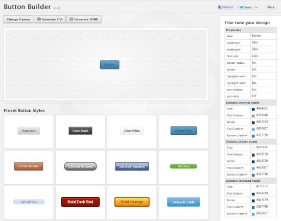 UICloud's Button Builder[/caption]
The main canvas shows the button and reflects each modification you apply. Below the canvas you find the preset button styles. Placed above the canvas are the buttons necessary to generate the corresponding HTML and CSS. The right side of the screen is where the real power lies. Here you can fine tune your buttons. At first sight you might think it's just a static table representing the looks of the button shown inside the canvas. But try clicking inside the table. Each value can be manipulated easily.
[caption id="attachment_72969" align="alignnone" width="549"] UICloud: Fine tune your buttons[/caption]
We don't actually see a shortage of CSS generators on the web, but the Button Builder on UICloud stands out from the crowd as it is one of the most intuitively usable web apps I've ever worked with for this special use case.
[caption id="attachment_72970" align="alignnone" width="550"]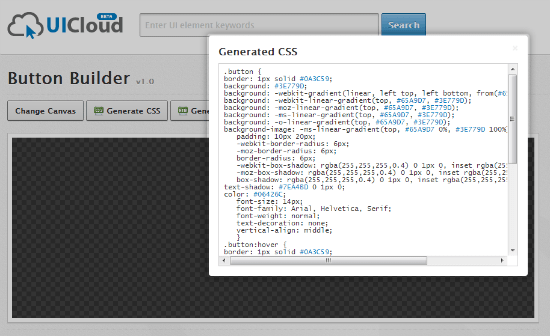 UICloud: Generated CSS[/caption]
Jack Cai told me that the Button Builder is just the first app in a series of more builders to come. So expect builders for progress bars, tabs and menus in the near future.
Social Media: UICloud Keeps You On Track Of New And Exciting Design Elements
If you want to keep track of what's going on at UICloud, there is a plethora of possibilities at your disposal. You could subscribe to UICloud's Twitter account, like them on Facebook, subscribe to their RSS feed or even - old-school - subscribe to a mailing list.
Whichever way you choose, choose one!
Related Links:
- Jack Cai´s Homebase - Double-J Design
- The New Platform For UI Design Elements - UICloud

Only 25 UI elements in 1 UI set? That doesn’t seem like much.
Not really works like that. Some of them contains over 100 in one set, some set just a button design. You can say on average 25 elements per set. Thanks
Oh I see how it works. Sorry, I think I was confused by the Author’s use of the full stop instead of a comma. The way the author used the full stop it looked like only 25 elements in 1 UI set. Not 25,000 UI elements in over 1,000 sets. Thanks for clearing that up Jack.